Noir Essence Niche Perfume — Cosmetics Box Packaging
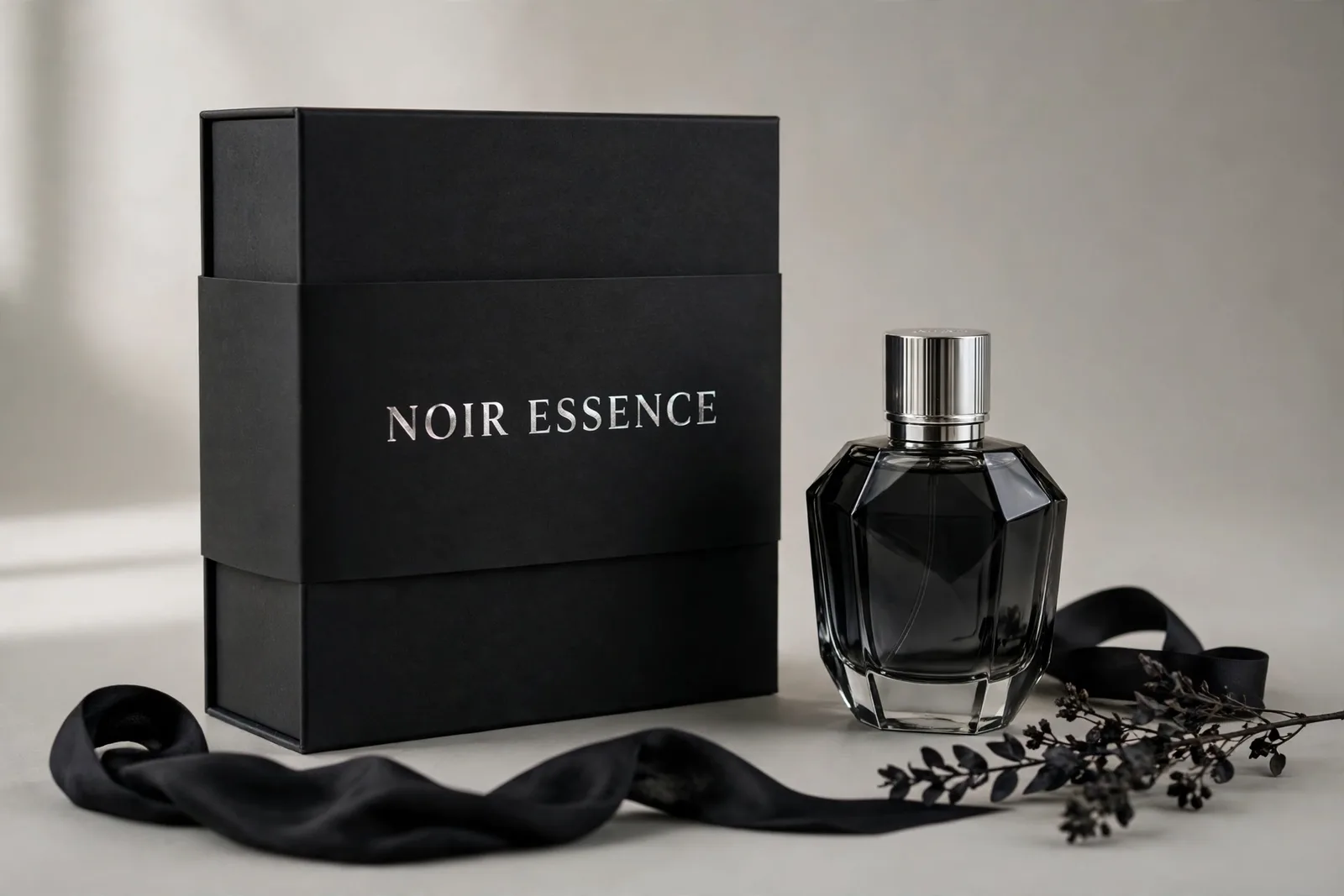
Matte black rigid perfume box with silver-foil sleeve for Noir Essence — flat sheet, assembly view, 3/4 hero, foil close-up, material spec. By WebStackRank.
From flat sheet to finished pack
Click any view to open it in the viewer.
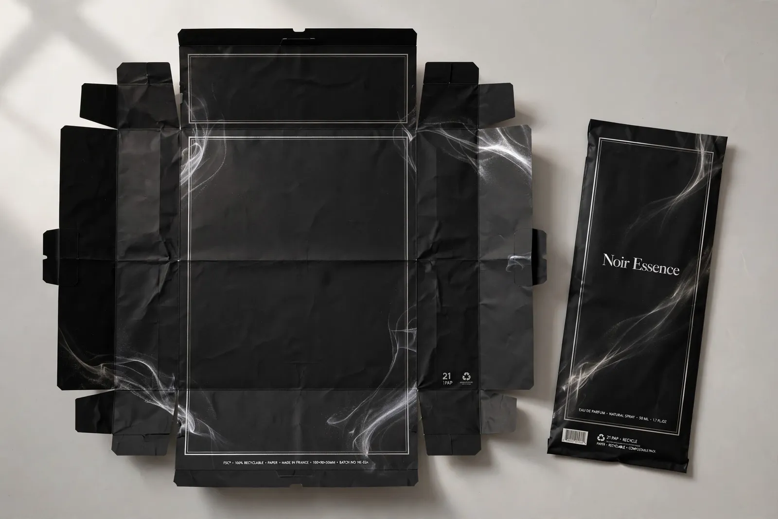 Flat printed components
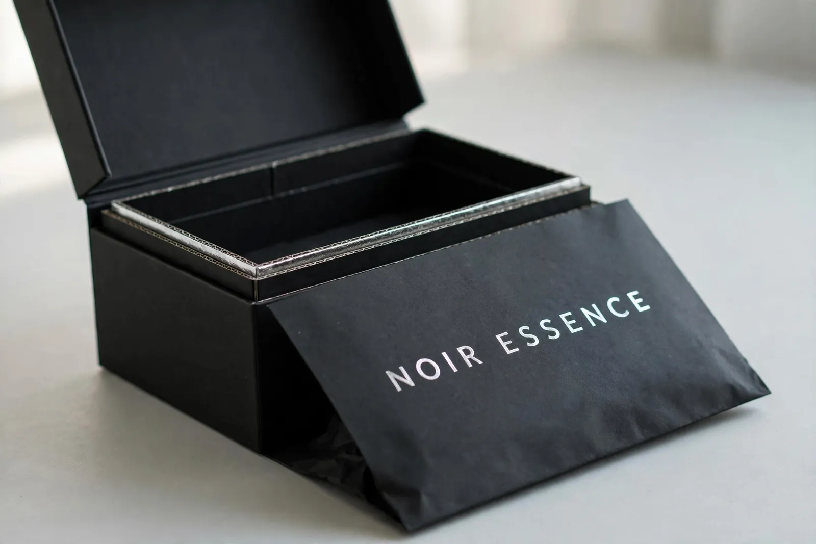 Mid-assembly
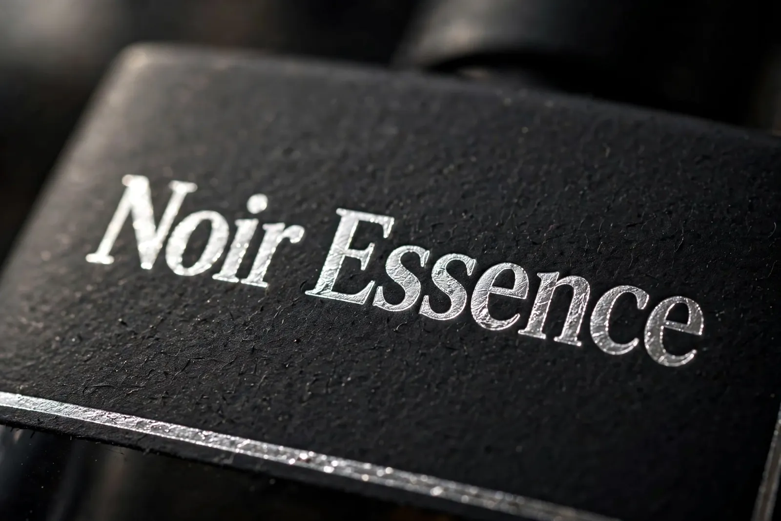 Material close-up
Challenge
Noir Essence, a fictional niche perfume house, needed packaging with unboxing theatre — a box that feels like an event before the flacon ever appears. Matte black on black is easy to get wrong: flat, muddy, illegible. The design had to keep silver as a single razor of light across the whole construction, protect the flacon in rigid board, and show exactly how the printed wrap and sleeve become the finished box.
Approach
We designed the packaging as a material-first story, presented in the order the box actually comes to life. The set LEADS with the flat, open, fully-printed wrap and sleeve artwork — the packaging material itself, designed: matte black art paper with wrap-over edges and fold creases, the slip sleeve carrying the letterspaced NOIR ESSENCE wordmark in silver foil, a fine silver keyline border, a subtle silver smoke texture drifting across the panels, fine-print microcopy and barcode in place. Then an assembly view shows the rigid shell open with the sleeve half-slid on, followed by the assembled 3/4 hero shot beside the faceted flacon and a silver-foil macro close-up. The restraint is the luxury — black, silver, and shadow doing all the work.
Outcome
A packaging presentation that sells both the design and the craft — clients see the printed wrap, the sleeve assembly, and the finished box in one narrative. The flat-sheet view doubles as printer reference for accurate quoting and wrap-making.
Noir Essence Niche Perfume is a concept piece created by WebStackRank to demonstrate a packaging design. Brand names are fictional and the figures shown are sample data — it is a design concept, not a client deliverable.