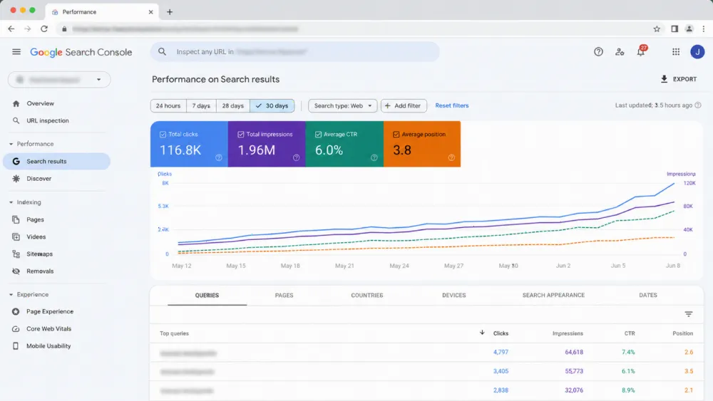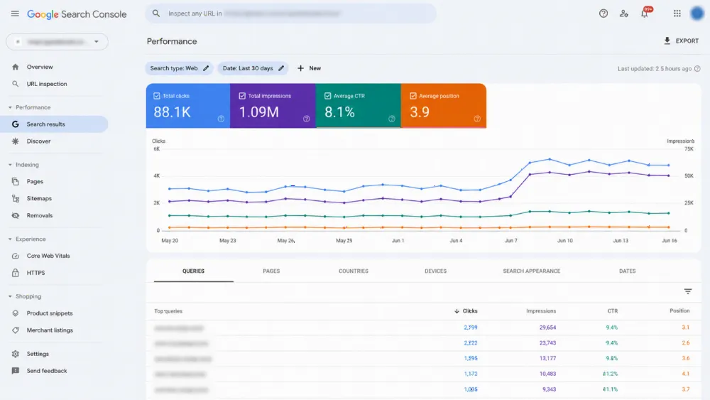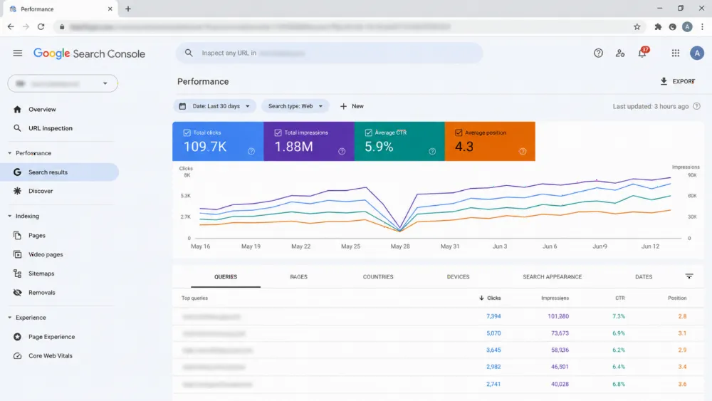
A lead-generating website combines three disciplines: SEO to attract visitors who are ready to buy, UX to make contacting you effortless, and CRO to test and improve every step. Most business sites fail because they invest in only one of the three — traffic without conversion, or design without visitors.
Want all three in one build? WebStackRank's conversion-focused web design and SEO-friendly web development ship sites engineered to rank, persuade and convert — get a quote.
How does SEO turn your site into a magnet for ready-to-buy visitors?
Search traffic is intent traffic. Someone typing "emergency plumber near me" has their wallet out; someone typing "how to fix a leaky pipe" wants free advice. A lead-gen SEO framework targets the first kind of query — buying-intent keywords — with service pages and location pages that answer them directly, instead of chasing vanity rankings on informational terms that never convert.
This is where the old industry joke earns its keep: the best place to hide a dead body is page two of Google. The top organic result captures a disproportionate share of clicks, and BrightEdge research has long found that organic search drives the majority of trackable website traffic — which is why ranking for the keywords that signal buying intent is the top of your lead funnel. Building pages around those keywords is the core of a scalable programmatic SEO system for US businesses, and it works best when the technical foundation is solid — see our technical SEO playbook for the crawl and index basics.
Why does local SEO matter more than national SEO for service businesses?
Most US service businesses need the customer five miles away, not five states away. When someone searches "HVAC repair near me," Google prioritises nearby providers — and the map pack listing above the organic results gets the first look. Owning that local real estate requires three things:
- A complete Google Business Profile — correct hours, categories, photos and services. This listing often outranks your own website for local queries.
- Name, address and phone consistency — identical NAP details across your site, directories and review platforms.
- A steady stream of reviews you reply to — review volume, recency and your responses all feed local rankings.
Then mirror that geography on your site: mention the neighbourhoods and cities you actually serve, with dedicated service-area pages where it makes sense. Our local SEO system for US service businesses maps this end to end, and our no-retainer SEO service is built for exactly this kind of local visibility work.
What UX principles turn visitors into leads instead of bounces?
Steve Krug titled his usability classic Don't Make Me Think — and that remains the whole of lead-gen UX. A first-time visitor should grasp what you do, who you serve, and how to hire you within three seconds. Anything that forces a visitor to decode your site is friction, and friction kills conversions.
Mobile is where this discipline gets tested. Google and SOASTA research found that 53% of mobile visitors abandon a page that takes longer than three seconds to load — and a cramped, pinch-to-zoom layout is a slower, crueller version of the same problem (Google/SOASTA). Build mobile-first: thumb-sized tap targets, a visible call button, and a contact form that survives a one-handed scroll. Speed and structure both matter; our guide to fast, SEO-ready websites for US businesses covers the performance side, while fixed-price web design shows how we package it.
How do you design CTAs that people actually click?
Eye-tracking research popularised the F-pattern: visitors scan across the top, down the left edge, and across once more. Put your primary message and CTA where the eyes already go — above the fold, in the hero, and repeated after key proof points. The four highest-converting placements are the hero section, top-right header, immediately after content, and a sticky mobile footer.
But placement is only half the battle — the words on the button matter as much as the colour. "Submit" and "Contact Us" feel like obligations. "Get My Free Quote" and "Book Your Consultation" promise value. Pair each CTA with a micro-commitment reducer ("Free, no-obligation", "Takes 60 seconds") and watch hesitation drop. When the button works, the next step is making sure the form behind it doesn't undo the goodwill — see our lead-generation conversion system for the full CTA-to-form journey.
Why do long forms kill conversions — and what's the fix?
Every field you add is a reason to quit. The classic cautionary tale is Expedia, which famously found that removing a single confusing field from its checkout form was worth an estimated $12 million in annual profit (Expedia case study). Ask only what you need to start the conversation — usually name, email and phone. A local contractor doesn't need a company name to schedule a callback.
When you genuinely need more data, use progressive profiling: capture the basics first, then collect details during the follow-up call or in later interactions. B2B teams can pace qualification across the nurture sequence instead of front-loading it. And always offer an escape hatch — a click-to-call button next to the form for visitors who'd rather talk than type. Form and phone data should land in the same place, which is a CRM integration decision worth making early.
How does CRO turn website guesswork into measurable growth?
Design gets you a good-looking site; conversion rate optimisation gets you a site that sells. CRO is disciplined experimentation: hypothesise, test, measure, keep what wins. Start with the three highest-leverage tests:
- The headline — does a clear, specific promise beat a clever slogan?
- The CTA — does benefit-driven button copy outperform the generic version?
- The hero proof — does a real team photo and a real number beat stock imagery?
Run one test at a time with a clear success metric (form submissions, not pageviews). CRO never ends because visitor behaviour drifts — treat your site like your best salesperson: give it regular coaching. For the tooling side, our automation workflows guide shows how to pipe test results into your marketing stack automatically.
How does social proof turn sceptics into leads?
Five gold stars persuade faster than five paragraphs of marketing copy. Social proof works because it outsources trust to other people. A lead-gen site needs three validation types:
- Third-party reviews pulled from Google or industry platforms — authenticity matters, so don't host testimonials only on your own site.
- Client logos — silent endorsements that scan in seconds.
- Short case studies — one problem, one fix, one result, with real numbers.
Placement is the strategy: position your strongest proof next to the point of action — the testimonial beside the form, the logo strip under the CTA. A glowing review read ten seconds before someone clicks "Submit" melts away the final hesitation. If you're starting from zero, our cost guide helps you budget a rebuild that earns reviews faster.
What lead magnet captures visitors who aren't ready to buy yet?
Most visitors won't convert on the first visit — so give the not-ready-yet crowd a reason to hand over their email. A lead magnet trades genuine value for contact details: checklists, mini-guides, cost calculators, free estimates or templates. The rule is specificity — solve one real problem, like a plumber's guide to finding hidden leaks, not a company brochure.
Match the magnet to intent: low-intent browsers get educational content; high-intent buyers get pricing transparency or a free estimate. Then redirect new subscribers to a thank-you page that delivers the download and offers the next step (book a call) while attention is hot. Interactive magnets outperform static ones — a "what's my project worth?" quiz or a cost estimator both entertains and pre-qualifies, filtering out browsers before they reach your inbox. WebStackRank's own quote calculator is built on exactly this principle.
Should paid traffic land on your homepage or a dedicated landing page?
A dedicated landing page — every time. Sending ad clicks to your homepage is like advertising emergency plumbing and routing the call to a general home-repair menu. Message match — the ad's promise echoed in the page's headline — is what makes paid traffic convert.
A landing page is a sniper: one offer, one audience, one action. A microsite is a shotgun: multiple pages educating a broader audience over time. To make the sniper shot count, remove the top navigation menu — every link that doesn't lead to your form is an exit door. HubSpot's landing page research famously found that businesses with 30+ landing pages generate 7x more leads than those with fewer than 10 (HubSpot). If you're running paid campaigns, pair this with Google Ads for B2B lead generation and message-matched pages for each campaign.
How do you stop leads from leaking after they submit?
Form submissions that land only in an inbox die in spam folders and forgotten follow-ups. Connect every form directly to a CRM — your digital filing cabinet — so each enquiry is logged, tracked and routed the moment it's submitted. Lead routing matters most for multi-service businesses: a visitor who selects "commercial roofing" should ping your commercial estimator instantly, not sit in a general inbox.
Then automate the follow-up, because speed wins. Roughly 78% of buyers end up purchasing from the vendor that responds first — not the cheapest, not the best known, the fastest (market research widely cited across sales studies). MIT and InsideSales research, popularised by Harvard Business Review, found businesses are 21x more likely to qualify a lead when the first response lands within five minutes rather than 30 (HBR-cited research). Build a three-touch sequence: an instant confirmation with a call time, a day-two value-add (guide or review), and a day-three soft ask. Our AI automation workflows and WhatsApp Business API setup show how to run this around the clock.
How do you measure whether your lead-gen site is working?
Ignore vanity metrics. Pageviews don't pay salaries — qualified leads do. Define what counts as a win (form submission, phone click, booked call) and track it as a conversion goal in Google Analytics with event tracking on every action. Then attribute: which channel — organic search, Google Business Profile, ads, referrals — actually brings paying customers?
The old management maxim applies: what gets measured gets managed (often attributed to Peter Drucker). Review the funnel monthly: where do visitors drop, which pages convert, which sources deliver? The answers tell you whether to fix traffic, UX or follow-up next. Start the loop this week: open your site on your phone, and if you can't read the headline and tap the contact button in three seconds, you've found your first project.
Frequently asked questions
What is lead-generation website development?
It's the practice of building websites around one goal — turning visitors into enquiries — by combining SEO (to attract ready-to-buy traffic), UX (to make contacting you effortless) and CRO (to test and improve conversion rates). The result is a site that functions as a 24/7 salesperson, not a digital brochure.
How many form fields should a lead form have?
As few as possible — usually name, email and phone. Every extra field adds abandonment risk; the Expedia case famously showed one confusing field costing an estimated $12 million in annual profit. Collect deeper qualification data later through progressive profiling during follow-up.
How fast should I respond to a website lead?
Within five minutes. Research popularised by Harvard Business Review found businesses are roughly 21x more likely to qualify a lead when responding within five minutes versus 30, and about 78% of buyers go with whichever vendor responds first. Automate an instant confirmation so no lead ever waits.
Do landing pages really convert better than homepages for ads?
Yes. Message match between the ad and the page headline keeps the visitor oriented, and removing the navigation menu eliminates exit doors. HubSpot research found companies with 30+ landing pages generate 7x more leads than those with fewer than 10.
What is a lead magnet, and does it still work?
A lead magnet trades something valuable — a checklist, guide, calculator or free estimate — for a visitor's email address. It works when it's specific to one real problem and matched to the visitor's intent. Interactive magnets like quizzes and cost estimators also pre-qualify, filtering out browsers before they reach your team.
How much does a lead-generating website cost in the USA?
It depends on scope, but the pricing factors are the same everywhere: design, copywriting, SEO foundation, integrations and CRO testing. See our breakdown of how much a website costs in 2026 for current US ranges.
How long does it take to see results from a lead-gen site?
UX and form improvements can lift conversions within weeks. SEO-driven lead flow typically takes 3–6 months to compound. The fastest path is to launch the conversion foundation first (forms, CTAs, follow-up automation), then let organic traffic build on top of it.
Ready to turn your website into a lead machine? WebStackRank builds lead-generating websites for US businesses — found through SEO, effortless through UX, and tuned through CRO. Talk to our team or get a quote.