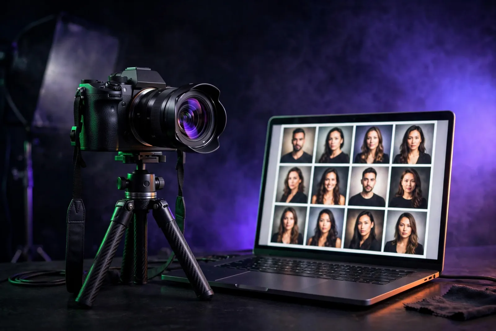
A photography portfolio website earns its keep when it converts cold visitors into booked clients — not when it wins design awards. The platform you choose, how you compress your files, and the order of your homepage matter more than any single visual flourish.
Is your portfolio losing inquiries to a slow site? Get a fixed-price quote for your photographer website and turn your best work into your best salesperson.
What does a photography portfolio website need in 2026?
A working portfolio is a sales tool first and a gallery second. Your visitor — from Instagram, Google, or a referral — has one job in the next ninety seconds: decide whether to inquire. That decision rests on whether your work fits, whether browsing feels professional, and whether they can find pricing and the contact form without hunting.
The non-negotiables in 2026:
- Hero image loading in under two seconds on mobile
- Featured work above the fold — no forcing visitors through ten thumbnails first
- Service areas and pricing tiers (or at least a starting point) stated plainly
- Real social proof, not anonymous pull quotes
- A contact path of three taps or fewer
As Ansel Adams put it: "There are no rules for good photographs, there are only good photographs." The same is true of portfolio sites — there are only sites that book and sites that don't. Anything not pulling weight toward an inquiry is decoration, and decoration on a slow site is a tax.
Go deeper: web development built for your industry · Core Web Vitals launch checklist
Why does portfolio design decide whether clients book you?
Two photographers can shoot the same caliber of work and book at wildly different rates from the same Instagram traffic. The difference is almost always the site.
A bride comparing wedding photographers in one city opens three or four sites in the same hour. She isn't grading portfolios against an objective standard — she's comparing the experience of looking at them. A six-second homepage loses her. An About page that's a wall of "passionate storyteller" prose with no face shot and no location loses her. A missing pricing page loses her — or sends you a generic price-shopping email you'll spend twenty minutes answering.
Clarity wins bookings. The most-booked photographers in any city have sites that say, in plain English, who they shoot, what it costs to start, and what happens after the form is filled in. The work is excellent — but the work alone doesn't close. The site closes.
Go deeper: lead-generation websites as conversion systems · UX + CRO + SEO framework for lead gen
How do you balance image quality and speed?
This is the single hardest tradeoff in photographer web design, and it's where most photographers lose. The instinct is to upload the largest, sharpest files possible — but a 6,000-pixel JPEG looks identical to an 1,800-pixel export on the web and takes five times longer to load.
Where to draw the compression line. Most working photographers can export web JPEGs at 1,800–2,400 pixels on the long edge, quality 75–82, with nothing the visitor can perceive lost on any screen up to 27 inches. WebP compresses 25–35% smaller than JPEG at equivalent visual quality, and AVIF goes smaller still — with Caniuse's tables showing roughly 96% global browser coverage for AVIF as of mid-2026 (caniuse.com/avif).
Lazy loading, responsive sources, and CDNs. Use native loading="lazy" on every image below the fold. Use srcset to serve a 600-pixel version to phones and a 2,000-pixel version to laptops — never push a desktop file at someone scrolling on the train. Serve everything behind a CDN: a photo from a nearby edge node can arrive in tens of milliseconds, while the same file from a shared server an ocean away takes many times longer. Google's Largest Contentful Paint guidance sets 2.5 seconds as the "good" threshold on mobile (web.dev LCP docs) — image-heavy sites that miss it tend to lose ranking position over time. The MDN documentation on responsive images (MDN responsive images guide) is the canonical reference for the patterns.
Go deeper: technical SEO for image-heavy sites · technical SEO audits
What layout actually converts on a photographer's site?
The homepage layout that converts best is boring on purpose:
- Hero image with one line of copy and one call-to-action
- A strip of three or four featured galleries with descriptive labels
- A short About paragraph with a face shot and location
- A pricing or services teaser
- A contact band
That's it. No carousel sliders. No "loading…" splash screens. No autoplay video that crashes mobile Safari.
Inside a gallery, sequence images like a magazine spread, not a contact sheet: lead with three strong frames, drop in a wider environmental shot, then a detail, then a portrait. A wall of identical-aspect images reads as flat. Most platforms support custom ordering — use it instead of leaving images in upload order, which is essentially random.
Go deeper: fixed-price web design · what a website costs in 2026
Which platform should you choose for a photography website?
The right platform depends on how much customization you need, your comfort with web tools, and whether you want client galleries (proofing and delivery) built in.
| Platform | Best for | Strengths | Tradeoffs | Typical cost |
|---|---|---|---|---|
| Squarespace | Solo photographers wanting polish without a developer | Clean templates, easy editor, decent image handling | Limited fine-grain performance control; template lock-in | $23–$49/month |
| Format | Visual artists wanting portfolio plus client proofing | Built specifically for photo portfolios; proofing included | Smaller ecosystem | $15–$40/month |
| Pixieset | Wedding and portrait pros who need client galleries first | Best-in-class galleries and delivery | Site builder less flexible than a true portfolio platform | Free–$50/month |
| WordPress (self-hosted) | Photographers wanting full control | Endless flexibility; SEO control; you own your stack | Requires upkeep: updates, backups, security | $10–$30/month + setup |
| Custom build (Next.js, headless CMS) | Established studios wanting a one-of-a-kind site | Maximum performance, total design freedom, owned codebase | Higher upfront cost; needs a dev partner for changes | $6,000–$25,000+ build |
The honest take: if you shoot fewer than 30 weddings a year and the goal is "look professional and book inquiries," Squarespace or Format gets you 90% of the way there for about $30 a month. A custom build pays off when traffic is high enough that conversion-rate improvements compound — or when your brand needs distinctiveness templates can't deliver.
Go deeper: fixed-price vs. retainer vs. hourly for web projects · Next.js development for maximum performance
How do you do SEO for photographers without sacrificing image quality?
Most photographer SEO advice is either keyword stuffing or "just take great photos" wishful thinking. The middle path works:
- Location-specific service pages. Shoot in three cities? You need three pages with distinct content — not three near-duplicates with the city swapped.
- Blog posts tied to real searches. "What to wear for engagement photos in Brooklyn" and "best engagement photo locations in Brooklyn" are both searched for. One good post can bring organic traffic for years.
- Alt text that describes the image. Not "wedding photographer Brooklyn" forty times — "Bride and groom under string lights at the Brooklyn Botanic Garden." It serves search engines and visually impaired visitors alike.
- Page speed. A slow image-heavy site leaks rankings; compression and CDNs are an SEO task, not just a technical one.
Go deeper: SEO-friendly web development · local SEO and the maps ranking system
What mistakes cost photographers the most bookings?
- Uploading full-resolution files everywhere — the #1 speed killer on portfolio sites.
- Hiding pricing — visitors assume the worst and move on.
- No face shot or location on the About page — clients book people, not brands.
- Carousel sliders and splash screens — decoration that slows the site and adds nothing.
- Images in upload order — random sequencing reads as careless.
- Keyword-stuffed alt text — reads as spam to Google and helps no one.
Go deeper: SEO-safe website redesign checklist · transparent pricing
Frequently asked questions
How many images should a portfolio gallery have?
Quality over quantity: 20–40 of your strongest frames per gallery. Clients decide in the first six images; a 200-photo dump dilutes your best work and slows the page. Curate ruthlessly.
What image size is best for web portfolios?
Export at 1,800–2,400 pixels on the long edge, JPEG quality 75–82 (or WebP/AVIF equivalent), served responsively via srcset. This is visually identical to full resolution on any web screen at a fraction of the file size.
Should photographers blog for SEO?
Yes — one genuinely useful post per month beats ten keyword-stuffed ones. Venue guides, what-to-wear posts, and location roundups capture couples early in their research and compound for years.
Do I need a custom website or is Squarespace enough?
For most working photographers, a well-configured Squarespace or Format site is enough. Go custom when your traffic is high enough that small conversion gains compound, or when your brand needs a level of distinctiveness no template can deliver.
How do I protect my images from theft?
Watermarks deter casual theft but hurt the viewing experience — most working pros skip them on portfolio images and rely on low web resolution plus right-click deterrents on client galleries. Register copyright for your best work if licensing matters to you.
How important are reviews for a photographer?
Very — especially Google reviews tied to your business profile. Couples shortlist from reviews before they ever see your portfolio. Ask every happy client, and make the ask easy with a direct link.
Can AI search find my photography business?
Yes, if your site is structured for it: location pages, FAQ content, service schema, and direct answers about pricing and availability. AI assistants cite clear, factual pages — not image sliders.
Turn your portfolio into your best salesperson
Your work deserves a website that sells as hard as you shoot. Fast loads, honest pricing signals, and a layout built around the inquiry — that's what separates booked-solid photographers from talented ones with empty calendars.
Get your fixed-price quote — tell us your genre and volume, and we'll map the exact build your portfolio needs.