A lead-generating homepage does three jobs in the first screen: it says what you do and who you serve, it shows proof that you can be trusted, and it makes the next step one tap away — in the UAE, usually a WhatsApp conversation. If your homepage gets traffic but few enquiries, fix those three jobs on this one page first. A full-site redesign is often unnecessary when the leak is concentrated here.
The short answer: the three jobs a lead-generating homepage must do
Job one is clarity: a headline that names the service and the customer, in the customer's words. Job two is confidence: proof — results, recognisable clients, reviews, a clear process — placed where doubt appears, starting above the fold. Job three is action: one primary call to action, repeated where a convinced visitor looks for it.
The sequence below follows that order — clarity, proof, action path — because a brilliant button under a confusing headline still fails.

The problem: traffic arrives, enquiries don't — and the leak is usually one page
Most service-business homepages were designed as brochures: a slider of services, an "about us" paragraph, a welcome message from the founder. Visitors from Google, ads or referrals have a different task: within seconds they check whether you solve their problem, whether people like them trust you, and how to start.
When those answers are missing, visitors do not explore harder; they tap a competitor. Before assuming the whole site is at fault, check whether the symptoms are site-wide or homepage-concentrated: if service pages produce enquiries but the homepage does not, the diagnosis points at this page — the scope of this guide.
Above the fold: headline, sub-headline and one primary action
The headline should complete the sentence "We help [customer] get [outcome]" using the service name the customer searched for — not a slogan, not the company name, not a welcome. The sub-headline adds the qualifier that builds trust quickly: area served, specialisation, or how the work runs.
Then one primary action. Two competing buttons of equal weight — "Get a quote" and "Learn more" — split attention and weaken both. Choose the action that matches how customers actually start: for most UAE service businesses that is a WhatsApp chat or a call, with the form as the supporting route.
Keep the hero fast and stable as well as clear. On mobile, the headline and button must appear quickly and stay put: Google's Core Web Vitals thresholds — Largest Contentful Paint at or below 2.5 seconds and Cumulative Layout Shift at or below 0.1 — are the practical test of whether the first screen does its job or leaks visitors before they read it.
The WhatsApp CTA: placement, pre-filled message and mobile behaviour
In the UAE, WhatsApp is the default enquiry channel for service businesses, yet many homepages bury it in the footer. Place the WhatsApp call to action in the hero as the primary button, repeat it after the proof section, and add a persistent mobile button that stays visible while scrolling, positioned so it never covers content.
Build the link properly. WhatsApp's click-to-chat format is a wa.me link: the business number in full international format, with no plus sign, spaces or leading zero, plus an optional pre-filled message added as a URL-encoded text parameter. The pre-filled message matters more than the button colour: "Hello, I found you through your website and I would like a quote for…" removes the blank-page problem, tells you the enquiry source, and starts the conversation one step ahead.
Match the message to the section where possible — a button under a specific service can pre-fill that service's name. For businesses that outgrow a single handset, our WhatsApp Business API setup service covers the multi-agent route; the homepage link stays the same one-tap pattern.

Proof in the order visitors need it: results, logos, reviews, process
Proof fails when it is dumped in a single "testimonials" block at the bottom. Sequence it by the doubts visitors actually have. First, outcome proof near the hero: the result you deliver, stated plainly and only where true and checkable. Second, recognition: client logos or sectors served, so visitors can place themselves. Third, reviews: named, specific and recent, placed beside the services they describe.
Fourth, process proof: three or four steps showing what happens after the enquiry — reply, assessment, proposal, start. A visible process answers the nervous buyer's "what happens if I tap that button?" Keep every claim verifiable; invented numbers destroy the trust this section exists to build.
Routing below the fold: services, sectors and the second CTA
A homepage is not a landing page: it must route several visitor types without forcing each through one funnel. Below the fold, give each main service a short block with its own link inward, ordered by what customers buy most, plus a sector or area section where that genuinely differs.
Repeat the primary call to action after the proof and at the end of the page; a convinced visitor should never scroll back up to act. This is also where the secondary route belongs — the form or booking link — clearly subordinate, not competing.
What to cut: the homepage elements that cost enquiries
Cut the auto-playing slider: it hides your headline behind rotating slogans and delays the main content. Cut the welcome message and company history from the top half; visitors earn the about story after the offer is clear. Cut pop-ups that fire before the visitor has read anything, and header social-media icons that offer exits before the enquiry path.
Cut vague calls to action — "click here", "learn more", "submit" — and any element you cannot connect to one of the three jobs.

Homepage-only redesign or full-site redesign? A scope checklist (table)
Use this checklist before accepting any quote. Homepage-only is enough when the first column describes you.
| Check | Homepage-only redesign | Full-site redesign |
|---|---|---|
| Where enquiries leak | Homepage underperforms; inner pages convert | Every template underperforms |
| Structure | Navigation and service pages are sound | Navigation no longer matches the offer |
| Technology | CMS updates and edits work normally | Platform is unsupported or cannot be edited |
| Brand | Current brand is staying | Rebrand or repositioning is planned |
| Rankings | Rankings sit on inner pages and homepage | Site-wide ranking or migration problems |
If the right column wins on technology or brand, homepage work alone will not hold. If the homepage is the leak, a one-page rebuild on a fixed-price structure is the proportionate job — and our pricing shows how WebStackRank scopes work of this size.
Measuring the redesign: enquiry tracking before and after
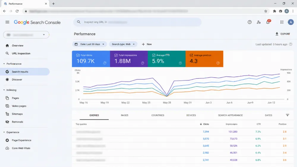
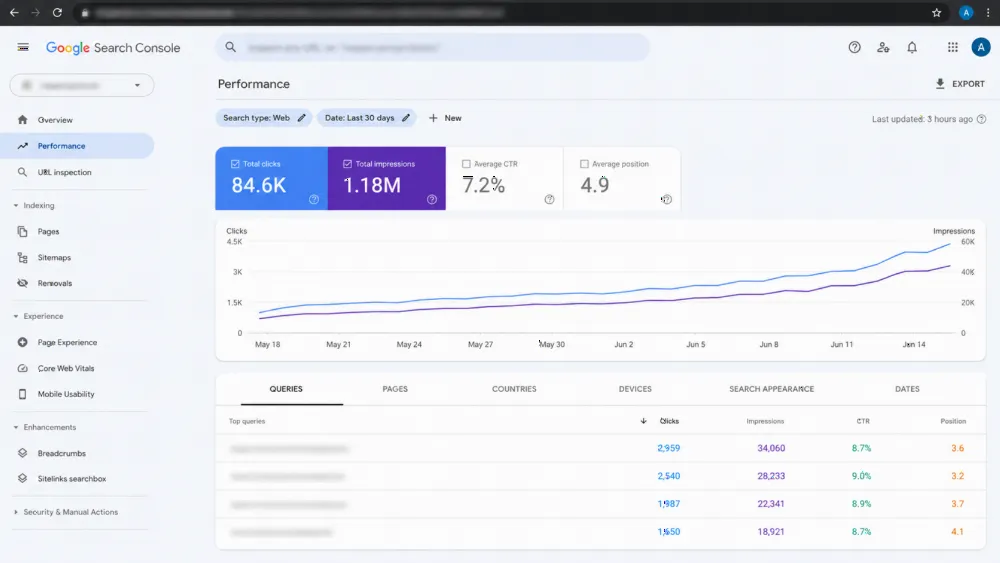
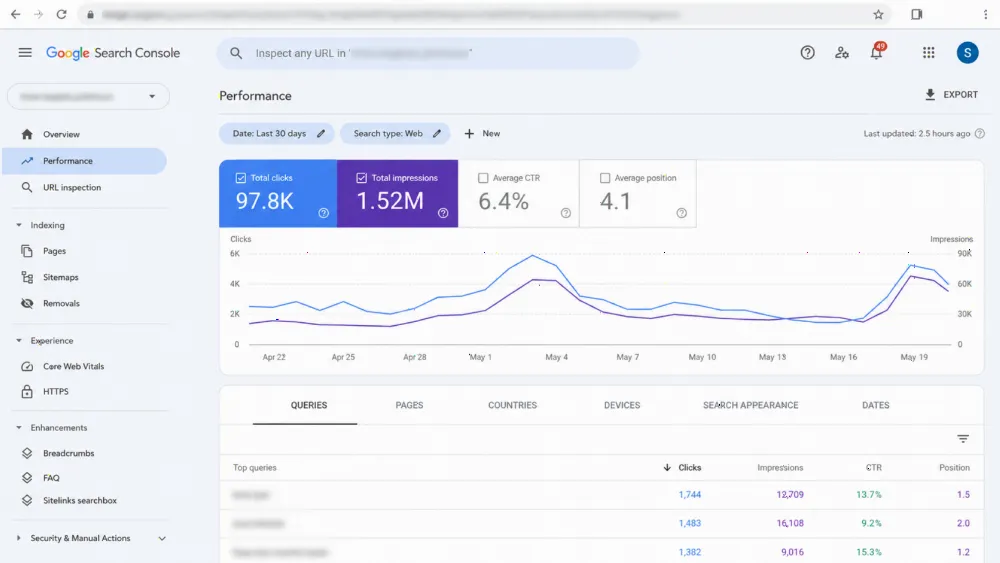
A redesign you cannot measure is an opinion. Before launch, record a baseline for at least a few weeks: homepage sessions, WhatsApp clicks, calls and form submissions from the homepage, tracked as separate events rather than one blended "conversions" number.
After launch, compare the same measures over a similar period and traffic mix. Judge the WhatsApp path in particular — clicks per placement, and how many became real conversations. Protect rankings by keeping the URL, title intent and internal links stable, following our website redesign SEO migration checklist.
Common homepage redesign mistakes
The most common mistake is redesigning for the owner's taste instead of the visitor's three questions, producing a prettier brochure with the same leak.
Other frequent errors: making the form the only route when customers prefer WhatsApp, hiding the phone number on mobile, placing reviews where nobody reaches them, launching without a baseline, and approving a full-site quote for a homepage problem. A web design company in Dubai should explain, page by page, why its quoted scope matches where your enquiries actually leak.
Frequently asked questions
What should be above the fold on a service business homepage?
A headline naming the service and the customer it serves, a short sub-headline adding area or specialisation, one primary call to action — usually WhatsApp or a call in the UAE — and the first piece of proof, such as a review summary.
Where should the WhatsApp button go on a homepage?
In the hero as the primary action, again after the proof section and at the end of the page, plus a persistent mobile button visible while scrolling. Each link should use the wa.me format with a pre-filled message matched to its section.
Should my homepage use a form or WhatsApp as the main enquiry route?
Make the route your customers already prefer the primary one, and keep the other as support. For most UAE service businesses, WhatsApp starts more conversations because it needs no form fields, while the form suits detailed or document-heavy enquiries.
How will I know if the homepage redesign worked?
Compare enquiry events — WhatsApp clicks, calls and form submissions from the homepage — against a baseline recorded before launch, over a similar period and traffic mix. If enquiries rise while traffic is flat, the redesign worked.
Does a homepage redesign risk my Google rankings?
The risk is low when the URL, search intent, headings' meaning and internal links stay stable and the page stays fast. Risk rises when URLs, content or structure change together — one reason a homepage-only scope is safer.
Rebuild your homepage around enquiries (CTA)
If your homepage gets visits but not enquiries, start with the page itself: headline, proof order and the WhatsApp path. WebStackRank redesigns homepages and full sites through web design in the UAE, with fixed-price packages from AED 990 for a one-page website and AED 2,490 for up to five pages, an itemised proposal within 24 business hours, and 50% deposit with the balance at launch. Send us your homepage link, and we will tell you plainly whether one page is enough. WhatsApp: +971 52 595 3174.