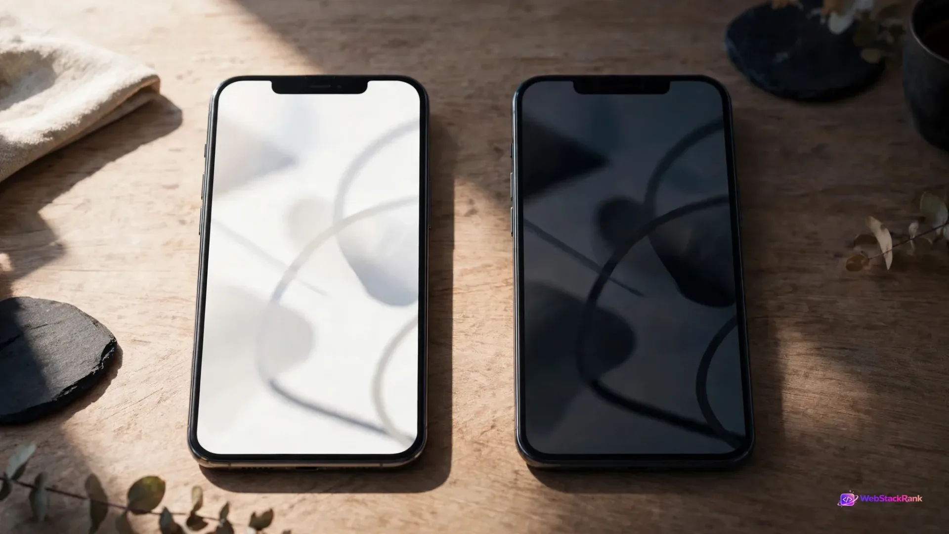
For most UAE business websites, a full dark mode is a distraction: a second theme to design, test and maintain, bought for visitors who arrive from search, read a few pages in daylight and fill in a form. Dark mode earns its cost in narrower cases — visual portfolios, app-like products with long sessions, audiences who work at night. Here is how to decide before you commission anything.
The short answer: most service sites should not build a full dark theme — and the exceptions
If your website is a service or brochure site whose visitors read service pages and send an enquiry, do not build a full dark theme. Keep a well-made light design, use dark sections where they add drama, and respect the system preference only if cheap to do properly. The exceptions are real: build a proper dark theme if your product is the screen itself — a SaaS dashboard, developer tool or media product used for long sessions, often at night — or a visual portfolio where the work must glow against darkness. Everything else is fashion spending a maintenance budget.
First, separate the three decisions: dark-only design, a toggle, and respecting prefers-color-scheme
"Add dark mode" bundles three purchases. A dark-only design replaces your look: every page dark — a branding decision suiting very few service businesses. A toggle keeps your light site and adds a complete second theme plus the switching machinery: the most expensive option, since both themes must be tested forever. Respecting prefers-color-scheme is the standards-based version: as MDN documents, this CSS media feature detects the visitor's system-level light or dark preference, and the site follows it. It still requires the full second theme; only the button goes. Judge each separately.

What dark mode genuinely helps: night use, visual portfolios and long app-like sessions
Dark themes have honest strengths. In low light, a dark screen is more comfortable than a glowing white page. For portfolios and galleries, a dark background works like a cinema wall: photography and video hold the eye. For app-like products with long, repeated sessions — dashboards, tools, media interfaces — users spend enough time there for theme preference to matter.
There is a narrow technical benefit: on OLED and AMOLED screens, individual pixels emit their own light, so dark pixels draw less power than bright ones. Treat it as minor and device-dependent — not a reason to retheme a brochure site.
Where it hurts: long text, forms, trust pages and product photography
The same theme works against the jobs a business website does. Long reading is harder in reverse: Nielsen Norman Group's review of the research (Budiu, 2020) found people with normal or corrected vision generally read better in light mode, dark mode's advantages concentrated among some users with specific visual impairments. Forms suffer next: labels, placeholders and error states often break in a rushed second theme — exactly where enquiries are won or lost.
Product photography is the practical killer for e-commerce: most product images are shot against white or light backgrounds, dropped onto dark pages, they show hard edges, look overexposed, or need a re-edited set.
The accessibility test dark themes keep failing: contrast, halation and small text
Dark does not lower the accessibility bar; it moves where sites fail. WCAG 2.2 Success Criterion 1.4.3 (Contrast (Minimum), Level AA) requires a contrast ratio of at least 4.5:1 for normal text and images of text, and at least 3:1 for large-scale text — in either theme. A brand colour that passes on white can fail on charcoal, and muted secondary text often falls below 4.5:1 in the dark theme. Our web accessibility compliance guide covers the wider obligations.
Then there is halation: light text on dark backgrounds can appear to glow or blur, an effect many people with astigmatism experience strongly — one reason pure white on pure black is a poor pairing. Material Design guidance recommends a dark grey surface (#121212) rather than pure black, with off-white text. Small text suffers most, and a phone outdoors in the Gulf fights reflections on a dark screen: test in real sunlight.

The hidden cost: a second theme to design, build, test and maintain
A toggle is not a colour swap; it is a parallel design system. Every token needs a dark value chosen deliberately — saturated brand colours are usually desaturated and lightened — and every component needs a second pass: navigation, buttons, cards, forms, error states, cookie banners and third-party embeds that may ignore your theme. Logos and light-background images need variants, and a bilingual site doubles the surface in Arabic RTL.
The cost continues: every new page and campaign must be designed and QA-tested twice, on real devices, in both themes. A second theme adds CSS and variant images to every page — part of the same page-weight conversation as our website performance budget guide. Before approving, ask what share of visitors will ever see this theme. If nobody can evidence an answer, you are buying it blind.
A decision checklist by business type: services, clinics, e-commerce, SaaS and creative
| Business type | Verdict | Why |
|---|---|---|
| Professional services, contractors, clinics | Light only, dark sections allowed | Trust, forms and long reading dominate |
| E-commerce and retail | Light default; test carefully before any toggle | Product photos are shot for light backgrounds |
| SaaS, dashboards, developer tools | Build a proper dark theme, toggle included | Long, repeated, often night-time sessions |
| Creative, media, luxury portfolios | Dark-only or dark-led can be right | The work is the content; atmosphere is part of the product |
| Content and publishing sites | Light default; respect system preference if cheap | Reading endurance decides return visits |
Whatever your row, decide on your own evidence: check analytics for session length and time of day. Our overview of the essential principles of effective web design puts this decision in context.
The middle path most UAE businesses should take: light default, dark sections, system preference respected
For most businesses, the right answer is the hybrid. Keep light as the default. Use dark sections intentionally — a hero, portfolio strip, video block, footer. Build on a properly responsive design foundation so both treatments behave on phones. If your platform supports prefers-color-scheme cleanly, respecting the system setting is a courtesy — provided the dark variant passes the same QA bar.
If you do build it: the minimum quality bar (tokens, logo/image variants, QA on real devices)
If your row says build, build properly or not at all. Define a dark token palette — surfaces, text, accents, borders, states — instead of inverting colours page by page. Use dark grey surfaces, not pure black, and off-white text. Produce dark variants of your logo and images with baked-in light backgrounds. Test every template, form state and embed in both themes, on real phones. Budget ongoing dual QA in writing, with your web design partner — a theme without a maintenance line has an expiry date.

Common mistakes
Inverting the light palette and calling it a theme. Using pure black backgrounds with pure white text. Forgetting error states, placeholders and third-party embeds until customers find them. And launching the toggle without checking how many visitors use it.
FAQ
Is dark mode better for visitors' eyes?
Not generally. In low light a dark theme can feel more comfortable, but Nielsen Norman Group's review of the research found people with normal or corrected vision generally read better in light mode, and visitors with astigmatism may find light text on dark backgrounds blurry through halation.
Does dark mode save battery?
Only on OLED and AMOLED screens, where dark pixels draw less power because each pixel emits its own light. LCD screens use a backlight that stays on, so the mechanism does not apply. Any saving depends on device and brightness.
What contrast ratio does a dark theme need?
The same WCAG 2.2 Level AA minimums as a light theme: at least 4.5:1 for normal text and images of text, and at least 3:1 for large-scale text, under Success Criterion 1.4.3. Check every colour in the dark theme itself — passing in light mode proves nothing.
Should we add a dark mode toggle or just follow the phone's setting?
Following the system setting through prefers-color-scheme is usually the better buy: you avoid toggle UI. Either route still needs the full second theme designed and tested — the saving is in the switching machinery, not the design work.
Can dark sections give us the premium look without a full dark mode?
Usually, yes. A dark hero, gallery or footer against an otherwise light site delivers most of the atmosphere owners are asking for, at a fraction of the cost and without the form, reading and maintenance risks. Prototype the section first; commission a full theme only on evidence.
Get both directions prototyped before you commit to either
If you are still torn, do not decide from screenshots in a meeting room. Have both directions prototyped on real content and test them in daylight and at night. WebStackRank's UI and UX design team in Dubai can build that comparison before you commit.