You can run a useful website UX audit yourself, in an afternoon, with no tools. Work through five passes — define the money journeys, read the evidence, walk the site against ten proven checks, watch five people try your key tasks, then repeat on mobile — scoring every finding by severity and effort. What survives is either a fix list for this week, or an evidence-based brief for a paid audit.
The short answer: the five-pass audit, in one table
| Pass | What you do | What it produces |
|---|---|---|
| 1. Journeys | Name the 2–3 routes to enquiry | The pages your audit covers |
| 2. Evidence | Read GA4, search queries and recordings | A suspicion list from behaviour |
| 3. Heuristics | Score each key page against 10 checks | Friction you can point to |
| 4. Task test | Watch five people attempt tasks | Proof of what blocks a stranger |
| 5. Mobile and WhatsApp | Repeat journeys on a phone | The journey visitors take |

The problem: redesigning on opinion while the friction survives
Most redesign briefs are built on taste: the owner dislikes the homepage, a competitor's site looks fresher. None of that identifies why a visitor left without enquiring. If the confusing menu, the service page with no next step and the failing form are not named before the redesign, they are rebuilt into it. An audit is how you name them. If your symptoms are broader, our check on the signs your website is costing you enquiries is the quicker first pass.
Pass 1 — Define the journeys that make money (homepage → service → enquiry)
An audit needs a scope, and the scope is journeys, not pages. Write down the two or three routes a visitor must complete to earn anything: typically homepage to service page to enquiry form or WhatsApp; a landing page to the same enquiry; a blog article to a service page. For each, note entry pages, every step, and the action that counts as success.
Audit only pages on those journeys, plus the homepage: a fifty-page site needs its money routes reviewed properly, not fifty reviews. If a page's wording is stale, note it as friction and move on — deciding which pages to keep, merge or remove is a content audit, covered in our guide to the content audit before a redesign, not this job.
Pass 2 — Read the evidence first: GA4, search queries and session recordings
Before judging, look at what visitors already did. In GA4, open the landing-page reports for your journey pages: where do visitors enter, where do they leave, and which pages produce enquiries rather than visits? A service page with strong traffic and few enquiries is a prime suspect; so is a step where sessions fall away sharply.
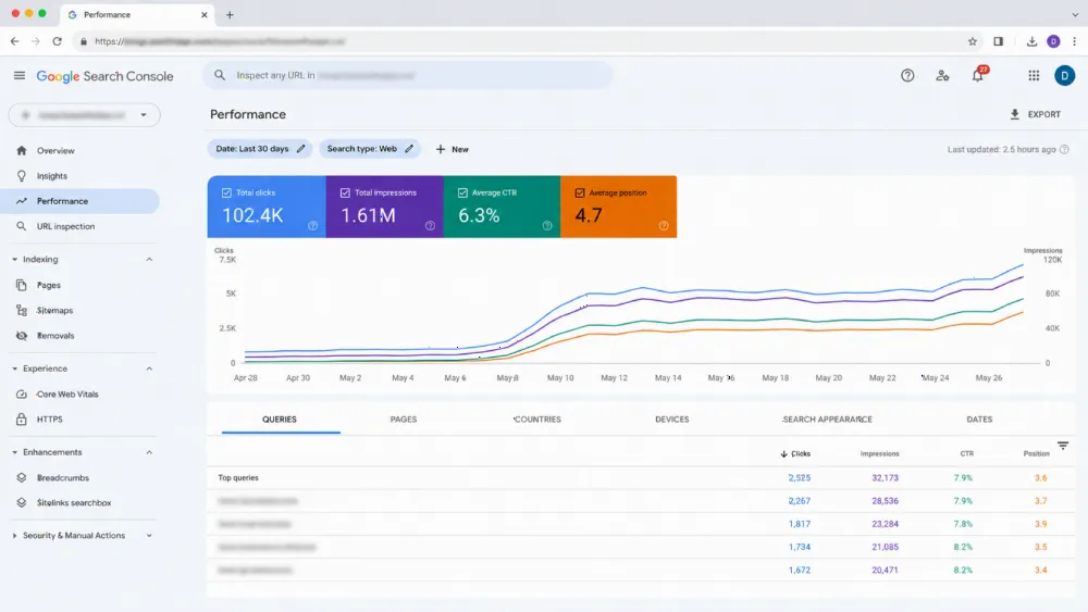
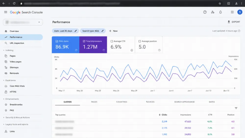
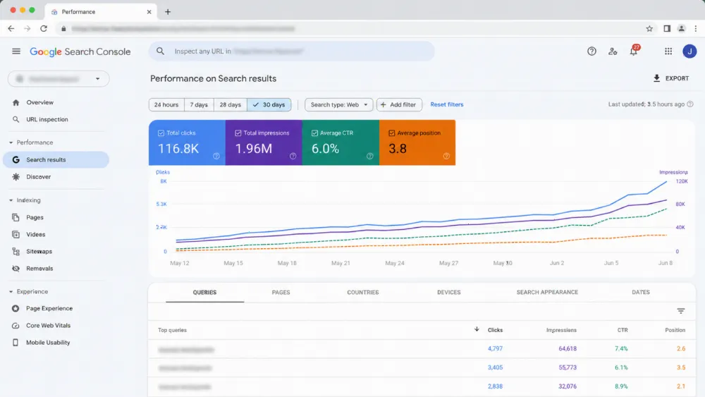
Add two sources. Search Console queries show the words visitors arrived with — a service they searched for that your page buries is a finding. Recordings or heatmaps, where you have them, show hesitation: abandoned forms, clicks on non-links. Record each suspicion as a question for the next passes. Evidence tells you where to look, not what is wrong.
Pass 3 — The heuristic walk-through: 10 checks, page by page
A heuristic evaluation checks an interface against recognised usability principles instead of taste. The standard set is Nielsen Norman Group's ten usability heuristics; each becomes one plain question per page:
- System status: does the page show what is happening — confirmations, progress, loading?
- Real-world match: does it speak the customer's language, not jargon?
- User control: can visitors go back, undo and escape, or do dead ends trap them?
- Consistency: do buttons, labels and layouts behave the same everywhere?
- Error prevention: does the design stop mistakes — or invite them?
- Recognition: can visitors recognise the next step, instead of remembering it?
- Efficiency: can a returning visitor move fast?
- Minimalist design: does anything compete with the page's one action?
- Error recovery: when something fails, does the message say what to do next?
- Help: can a stuck visitor find assistance without leaving the journey?
Walk each journey page against all ten, with a specific example per failure: "the form shows no confirmation, so visitors submit twice" is a finding; "the form feels off" is not. NN/g's method has evaluators work independently, then consolidate, because different people catch different problems — have a colleague walk the journeys separately if you can; if alone, repeat on another day.
Pass 4 — Task-test with five real people (scripts you can copy)
The heuristic pass finds what breaks the rules; only real people show what breaks in practice. NN/g's guidance for qualitative testing is small tests, iterated — around five participants per distinct user type surfaces recurring problems in one round; then fix and test again, rather than one large study. Recruit people like your customers who do not know your site — never your team.
Give each person the same tasks, worded as situations: "You need our service for a property in Dubai and want a price — show me what you would do." Then: "Find out whether we serve your area." Then: "Start an enquiry, but stop before sending anything real." While they work, say as little as possible: do not explain or point, never ask "was that easy?" — watch where they hesitate or misread, and note the step. A problem three of five hit is real, whatever your opinion was.

Pass 5 — Mobile and WhatsApp: auditing the journey UAE visitors actually take
Now repeat the core journeys on a mid-range phone, on mobile data — the visit customers have. Check what desktop review hides: tap targets hit first time, readable text without zooming, sticky buttons clear of submit, one-thumb menus.
Then audit the WhatsApp step itself, since for many UAE businesses it is the enquiry. Tap your button: does it open the right number, with a sensible pre-filled message, from every key page? Submit your form from the phone too, and confirm the lead arrives. Our mobile-first design audit goes further; this pass guarantees your audit covered the real journey.

Score and prioritise: severity × effort, and the fix-this-week list
Score findings on two axes. Severity: how completely it blocks the journey — a broken form confirmation outranks an ugly footer. Effort: what the fix takes — wording, template change, or development. NN/g's severity approach weighs frequency, impact and recurrence; apply the same questions.
Sort into three lists. Fix this week: high severity, low effort — unclear next steps, missing confirmations, buried contact routes. Brief for design or development: high severity, higher effort — template or form-behaviour changes. Note and monitor: low severity, or not yet seen in a task test. This list, not a mood board, is the deliverable; the baseline sits in our essential principles of effective web design.
DIY or paid audit? The decision rule (and what a paid audit must add)
Stay DIY while findings are visible, specific and fixable: labels, order, confirmations, friction your task test confirmed. Pay for a professional audit when evidence shows a problem your passes cannot locate; when journeys involve many user types, logins, payments or interacting language versions; or when the fix list points at rebuilding templates and you want an independent case first — for example ahead of a redesign, where our website redesign SEO migration checklist then protects the move.
A paid audit must add what you cannot give yourself: evaluators new to your site, recruited users matching your customers, and findings tied to evidence with severity argued, not asserted. If a proposal offers only a screenshot tour and opinions, decline it, and compare offers such as fixed-price web design scopes.
Common mistakes (auditing the homepage only; fixing taste, not friction)
The classic mistakes: auditing only the homepage while service pages carry the leaks; testing with staff who know the site; asking leading questions; treating one person's stumble as a redesign brief; and fixing findings in the order they annoyed you, not by severity. The deepest mistake is skipping the audit and letting a redesign settle arguments evidence could have settled.
FAQ
How long does a DIY website UX audit take?
An afternoon for a typical small business site: under an hour to define journeys and read the evidence, an hour for the heuristic walk-through, an hour or so of task tests, and a final mobile pass. Larger sites take longer because they have more journeys, not more steps.
What tools do I need to audit my own website?
Very few: GA4 and Search Console for evidence, a phone for the mobile pass, and a notebook or spreadsheet for findings. Recordings or heatmaps help if you have them, but the method works without them — the task test supplies the human evidence.
How many people should I test my website with?
Around five per distinct type of user, per NN/g's guidance for qualitative testing: enough for recurring problems to repeat in front of you. Test, fix, then test again with a fresh small group rather than running one large study.
What is a heuristic evaluation, in plain English?
A structured inspection of a page against ten recognised usability principles — Nielsen Norman Group's heuristics — instead of personal taste. Ask the same ten questions of every key page, note a specific example wherever it fails one, and score the failures with your other findings.
When is a DIY UX audit not enough?
When the evidence shows a problem your passes cannot locate, when journeys involve payments, logins or several user types, or when both language versions interact. A professional audit should then add independent evaluators, recruited user testing and severity argued from evidence.
Found more than you can fix? Get a UX audit with findings, not opinions (CTA)
If your five passes produced a list longer than your team can fix — or findings pointing at templates and form behaviour — that list is the right starting brief. WebStackRank's UX team works from evidence: journeys, task tests and severity-scored findings. Talk to our UI/UX design agency in Dubai, bring your scored list, and we will tell you honestly which items you can close yourselves. If the site needs rebuilding rather than auditing, start with our web design company in Dubai team.