HearWell — Hearing Clinic Website
Trustworthy clinical website for HearWell of Nashville — an animated hearing visual, doctor-led care story, and a no-pressure evaluation booking flow.
Challenge
HearWell is an independent Nashville hearing clinic led by a Doctor of Audiology, competing against big-box retailers that treat hearing aids like electronics. The clinic needed a website that communicates clinical credibility and genuine care — no pressure, no sales tactics — while explaining hearing evaluations, hearing aid styles, and tinnitus care in plain language. The design had to feel medical and trustworthy without feeling institutional.
Approach
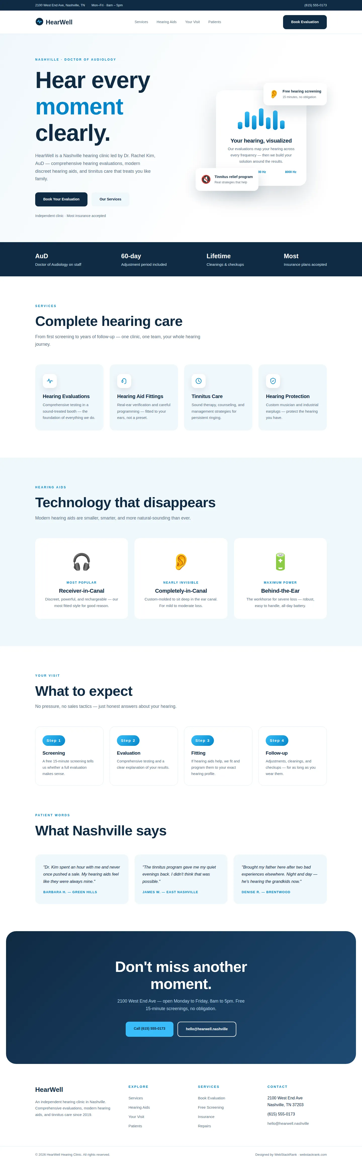
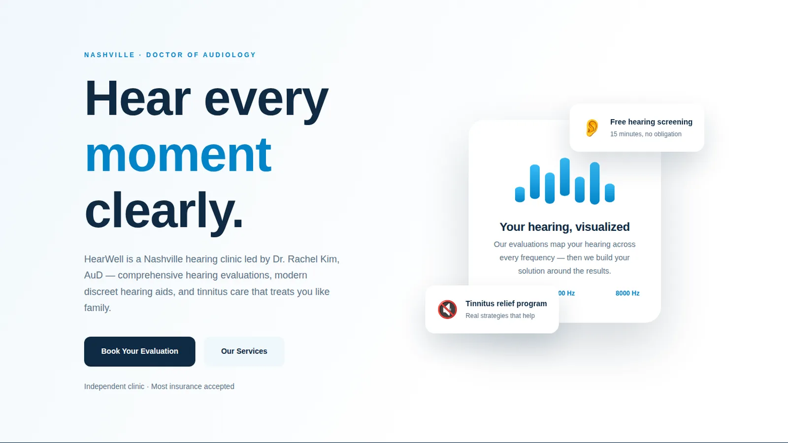
We built a classic-corporate site: white backgrounds, deep navy and sky-blue accents, Poppins typography, and a pure-CSS hero visual — an animated sound-wave equalizer card that makes "your hearing, visualized" instantly tangible. The services are explained plainly (evaluations, fittings, tinnitus care, protection). Hearing aid styles get simple, jargon-free cards. The four-step visit (Screening, Evaluation, Fitting, Follow-up) demystifies the process, and the free 15-minute screening is positioned as the no-pressure entry point. Dr. Kim's credentials lead the trust story. The free 15-minute screening is positioned as the no-pressure entry point throughout, because hearing care decisions start with trust, not technology. Every claim on the site — from the 60-day adjustment period to lifetime cleanings — is a real clinic policy stated plainly.
Design highlights
The hero's animated equalizer — seven bars pulsing on a loop — visualizes hearing itself, with frequency labels (250 Hz to 8000 Hz) adding clinical authenticity. Floating cards sell the differentiators: free screening, tinnitus program. The navy trust bar states the commitments (AuD on staff, 60-day adjustment, lifetime cleanings). Device cards use simple emoji-led visuals with plain-language categories (Most popular, Nearly invisible, Maximum power). The deep-navy CTA ("Don't miss another moment") closes with warmth, not fear.
Outcome
The site positions HearWell exactly right: the clinical alternative to the big-box hearing aid store. Visitors understand the process, the technology, and the no-pressure philosophy before they ever call. The animated sound-wave visual is memorable and ownable — a hearing clinic site that actually looks like hearing.
HearWell is a fictional brand created by WebStackRank to demonstrate a hearing clinic website concept. It is a design concept, not a client project.