LabPrime Diagnostics — Medical Laboratory Website
Precise swiss-grid website for LabPrime Diagnostics of Chicago — a live order board, panel guides, and a booking flow built for clarity and speed.
Challenge
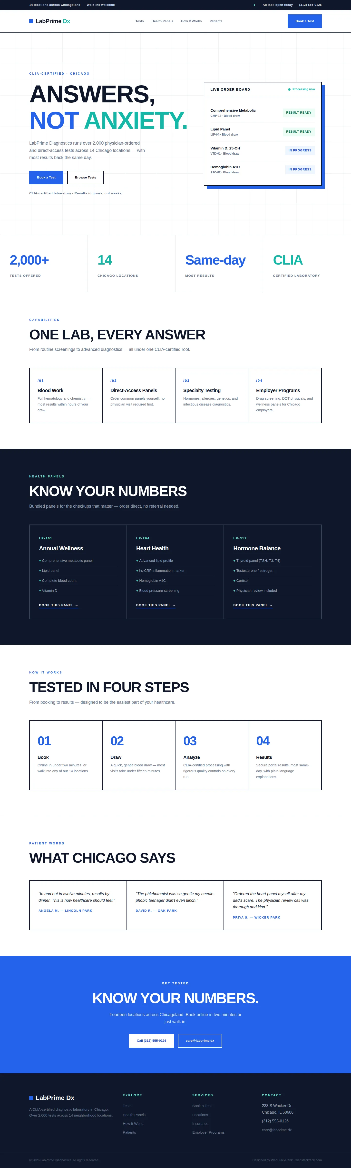
LabPrime runs 2,000+ tests across 14 Chicago locations with same-day results — a genuinely impressive operation hidden behind a dated, confusing website. The lab needed a site as precise as its science: clear test information, transparent direct-access panels, and a booking flow that takes two minutes. The design had to feel clinical and exact — swiss-grid rigor — while remaining warm enough for anxious patients waiting on results.
Approach
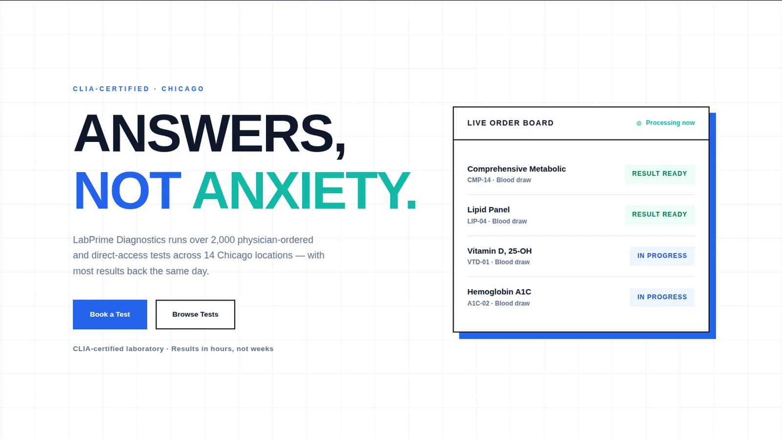
We built a swiss-grid site with total discipline: white backgrounds, a faint blueprint grid, clinical blue and teal accents, Inter throughout, uppercase headlines, and hard rules dividing every section. The hero features a "live order board" panel — test rows with status badges (Result ready, In progress) that makes the lab's speed tangible. A stats strip states the operation plainly (2,000+ tests, 14 locations, same-day results, CLIA-certified). Panels get SKU-style codes (LP-101, LP-204) with included-test lists. The four-step process (Book, Draw, Analyze, Results) is ruthlessly clear. Walk-in availability is emphasized alongside online booking, because lab patients split evenly between planners and the just-worried. The results portal gets its own mention in the process section, since result delivery is half the patient experience.
Design highlights
The blueprint-grid hero background and the live order board with its pulsing "Processing now" indicator make precision visual. Stats use oversized numerals in alternating blue and teal. Service cards use "/01" numbering in a bordered grid with hover tints. The panels section inverts to deep ink with teal code labels and "+"-prefixed test lists. The blue CTA band ("Know your numbers.") is direct and confident. Every border, number, and label follows the grid — the design equivalent of a well-run lab.
Outcome
The site now matches the operation: precise, fast, and transparent. Patients can find their test, understand the panels, and book in two minutes. The direct-access panel framing (order yourself, no referral needed) opens a conversion path most labs bury. It's a medical site that treats clarity as care — which, for anxious patients, it is.
LabPrime Diagnostics is a fictional brand created by WebStackRank to demonstrate a diagnostics lab website concept. It is a design concept, not a client project.