Ironcrest Builders — Construction Company Website
Ironcrest Builders delivers commercial, residential and industrial construction with in-house engineering and OSHA-aligned site safety on every project.
Challenge
Construction company websites tend to fall into two traps: the bland corporate template that says nothing, or the boastful brochure stuffed with invented project counts and unverifiable "30 years of excellence" claims. The brief for Ironcrest Builders — a fictional general contractor built as a WebStackRank portfolio sample — demanded a third path: a site that feels as rugged and confident as a well-run job site, while staying completely honest. No fabricated metrics, no invented awards. The design had to communicate competence and safety culture through craft alone — typography, rhythm, photography and restraint — because the copy rules forbade the usual shortcuts.
Approach
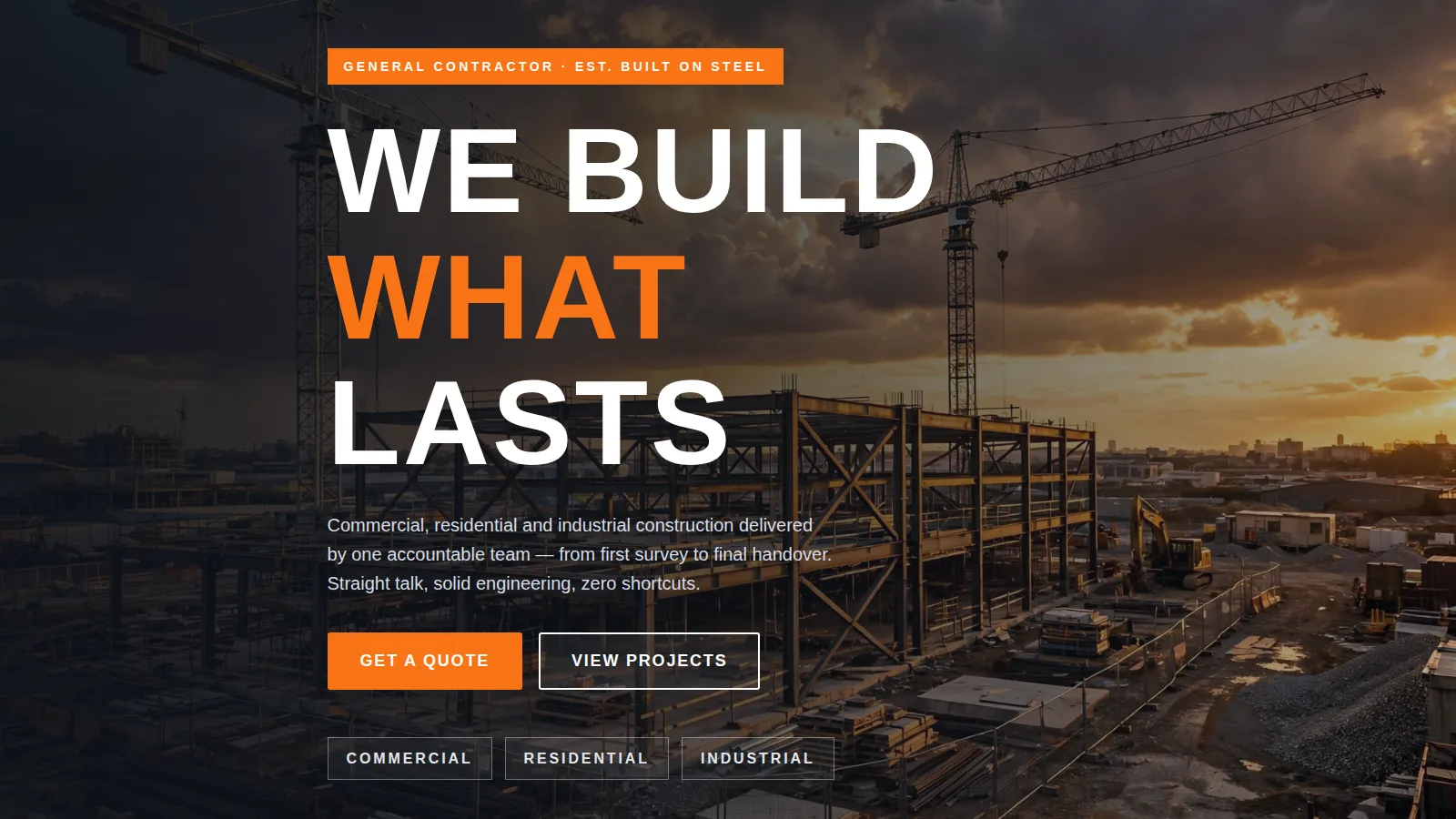
We leaned into an unapologetically industrial design language: charcoal and safety orange, Barlow Condensed set huge and uppercase, sharp corners, heavy grid lines and diagonal hazard-stripe motifs borrowed from site signage. The page follows a conversion path a real contractor would want: credibility (topbar with licensing note, certification-style capability strip), services, proof (featured projects with sector and location), trust-deepeners (a full safety section, a four-step process), short sample testimonials, then a low-friction quote form. Qualitative claims replace invented statistics — "ISO 9001 processes" and "OSHA-aligned safety" instead of fake counters. Photography stays real and unretouched in feel: a golden-hour tower-crane site for the hero, one concrete-and-glass build mid-construction for the project cards, reused with CSS crops to suggest breadth without filler images.
Design highlights
The hero is the anchor: full-bleed site photography under a left-weighted dark gradient, a kicker chip, the headline "WE BUILD WHAT LASTS" at up to 132px, dual CTAs and a qualitative badge row (Commercial · Residential · Industrial). A hazard-stripe divider slams into the dark certification band, which doubles as a compact "who we are" statement. The services grid uses thick charcoal rules with a full-invert hover — card goes dark, icon chip goes orange. The safety section is its own dark chapter framed by hazard stripes, with a five-point commitments checklist. The process band numbers 01–04 with the final Handover step filled solid orange.
Outcome
The finished sample reads like a contractor you'd actually hire: straight-talking, safety-obsessed and engineering-led. It demonstrates WebStackRank's range in trades and industrial design — bold without being loud, structured without feeling templated. The single-page build is fast, fully responsive, and ready to extend into multi-page territory (project pages, service detail pages, a careers section for recruiting crews) when a real client adopts the concept.
Ironcrest Builders is a fictional brand created by WebStackRank to demonstrate a construction company website concept. It is a design concept, not a client project.