Atelier Mona — Fashion Boutique Website
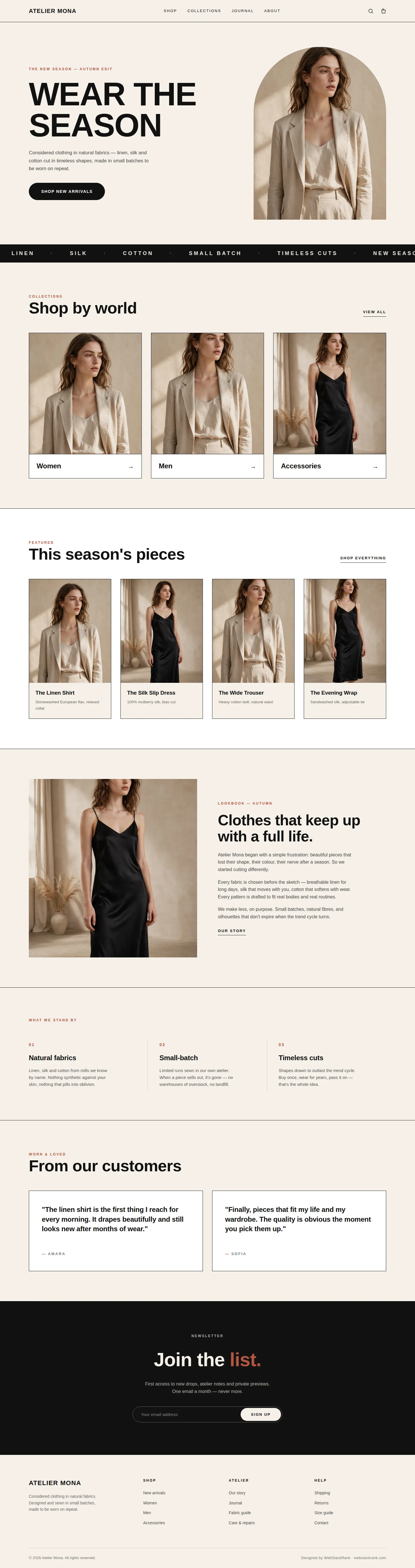
A flat-minimal editorial site for fashion boutique Atelier Mona: oversized Syne type, warm beige palette, arch-frame photography and calm product grids.
Challenge
Atelier Mona is a fictional fashion boutique selling small-batch clothing in natural fabrics. The brief called for a homepage that felt like a printed fashion editorial translated to the web: confident and quiet — without the visual noise most fashion templates rely on. The challenge was restraint. Every section had to earn its place through typography, whitespace and photography alone, since the palette was limited to warm beige, black, white and a single clay accent used sparingly. The layout also had to reuse a small set of generated images across hero, categories, product cards and the lookbook without any two slots feeling like duplicates.
Approach
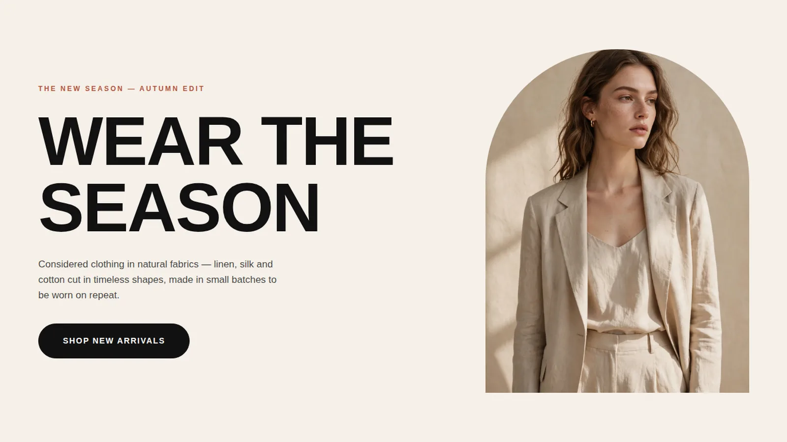
We committed to a flat minimal editorial language from the first wireframe. One display face, Syne, carries the voice at oversized sizes with tight tracking; Inter handles body copy. Flat color blocks replace shadows and gradients, and thin black hairline rules structure the grid. The hero gives the massive two-line headline "WEAR THE / SEASON" the full left column, balanced by the editorial photo held in an arch frame. For image reuse, each slot uses deliberate crops and focal-point positioning so the same two photographs read as distinct art direction. Motion is limited to a single marquee strip and gentle hover zooms, keeping the page calm.
Design highlights
- Oversized Syne headline (up to 120px) paired with a tall arch-framed editorial photograph in the hero.
- Black marquee strip scrolling fabric and value keywords — the only moving element on the page.
- Three flat category cards with bordered meta rows, followed by a bordered four-card product grid with fabric notes and no prices.
- Editorial lookbook split: full-height photograph beside a three-paragraph brand story.
- Three-column values section separated by hairline rules, numbered in clay.
- Black newsletter band with a pill email capture, and a four-column footer with a hairline bottom bar.
Outcome
The result is a boutique homepage that reads as a single confident statement: beige, black, clay, and type doing all the work. The strict restraint — flat surfaces, generous gaps, one accent color — gives the brand a distinctive signature that feels printed and permanent rather than templated. The layout scales cleanly: the grid collapses to two columns on tablet and one on mobile, and the hero headline stays proportional at every width thanks to fluid clamp sizing. Sample copy throughout keeps the tone minimal and elegant, with short sentences and no invented claims.
Atelier Mona is a fictional brand created by WebStackRank to demonstrate a fashion boutique website concept. It is a design concept, not a client project.