Ledgerly — Accounting Firm Website
Swiss-grid site for Ledgerly accountants — ledger-card hero, bordered service grid and a fixed-fee quote flow for businesses done with messy books.
Challenge
Ledgerly’s ideal clients — founders drowning in receipts — assume all accountants are interchangeable and expensive. The old site, all stock handshakes, did nothing to change that. The challenge was to make precision feel like a relief: a site that looks as organised as the books it promises, with the fixed-fee model impossible to miss.
The old site also failed the "are they like us?" test: stock handshakes and city skylines said nothing to a creative studio or a trades firm. Sector-specific proof was missing entirely.
Approach
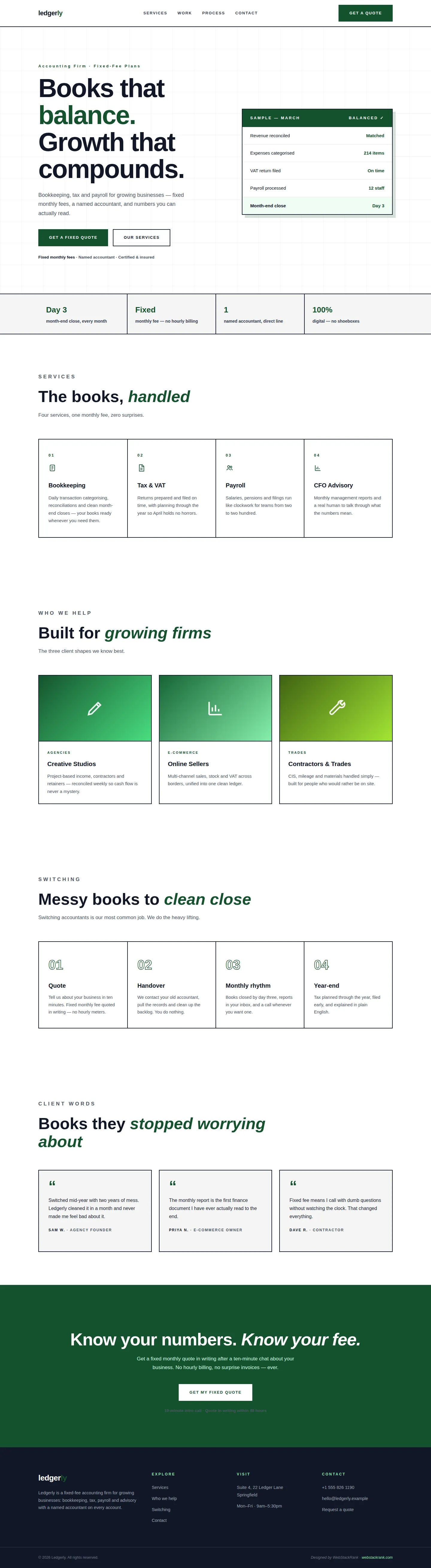
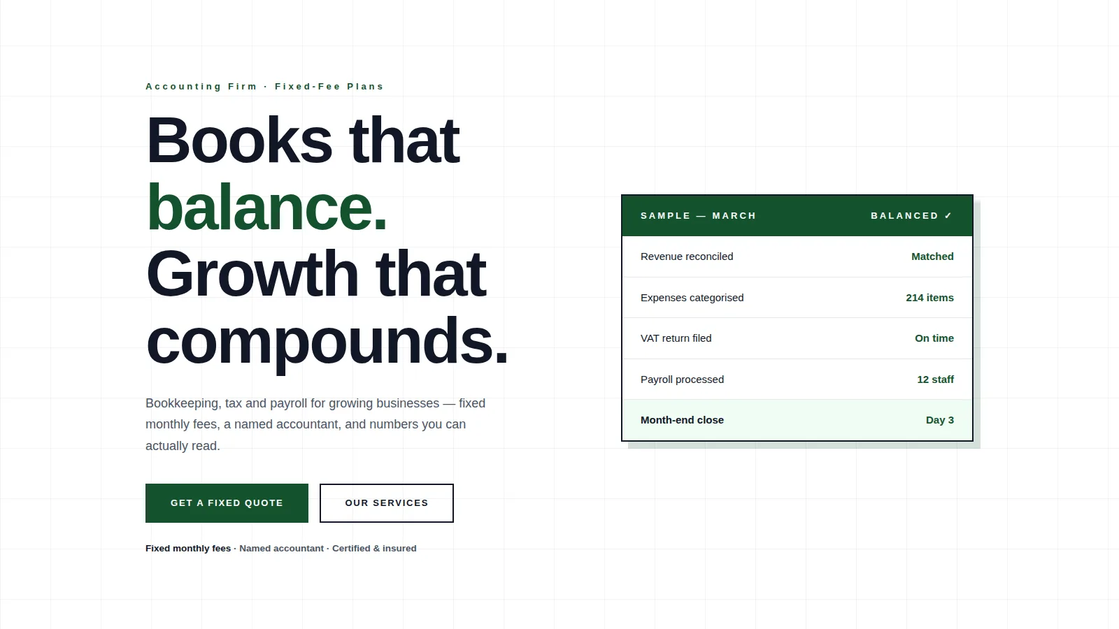
We designed a strict swiss-grid system: white canvas, hairline black grid, numbered service cells and a forest-green accent used like a highlighter. The hero pairs the headline with a ledger card showing a balanced month — the product, visualised. The trust bar is a four-cell stat band (day-3 close, fixed fee, named accountant). Every interaction is squared, bordered and deliberate; nothing is decorative.
We also built the page around the switching moment: most new clients arrive mid-mess, mid-year, mid-stress. The process band is written for them — "we do the heavy lifting" — and the fixed fee is stated four separate times.
Design highlights
Highlights include the ledger-card hero visual with a "Balanced" stamp, the bordered service grid with index numbers, outlined ghost numerals in the process band, and gradient client-type cards. The fixed-fee promise repeats in the hero, trust bar, process and CTA — because it is the entire positioning.
The grid is the brand: 2px rules, square corners, numbered cells. Even the testimonial cards sit on the grid. It is the visual equivalent of a balanced ledger — nothing out of place.
Outcome
The site now converts scepticism into quotes. Prospects see exactly what organised looks like, understand the fee model in seconds, and arrive at the intro call already convinced that switching is painless.
Prospects now arrive at intro calls having already self-identified their sector and understood the fee model. The first call is about fit, not basics — exactly where it should start.
Ledgerly is a fictional brand created by WebStackRank to demonstrate a accounting firm website concept. It is a design concept, not a client project.