RoamFree Rentals — Car Rental Company Website
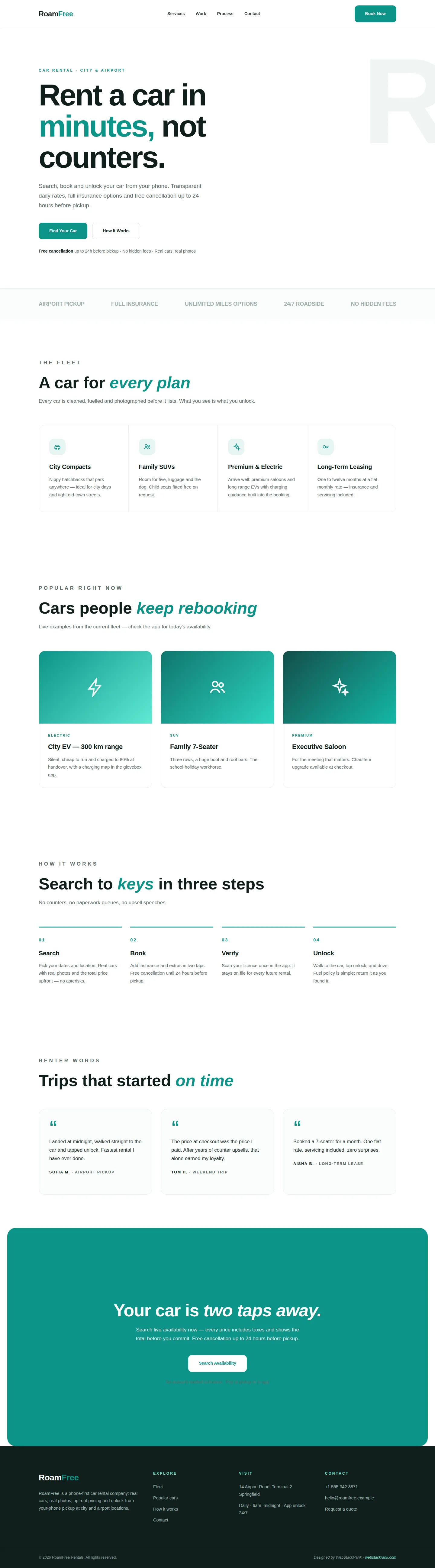
Flat-minimal site for RoamFree car rental — oversized type, live fleet cards and a three-step booking flow from search to keys, with upfront pricing.
Challenge
RoamFree’s advantage was its product — phone-first rental with unlock-from-app pickup — but its old site buried that story under stock photos of convertibles and a five-step booking form. The challenge was to make the site feel as fast as the service: instant comprehension, instant booking, zero friction. It also had to earn trust on pricing, the industry’s sorest point.
The phone-unlock pickup was the killer feature, yet the old homepage never explained it above the fold. Visitors bounced assuming RoamFree was just another counter queue with an app.
Approach
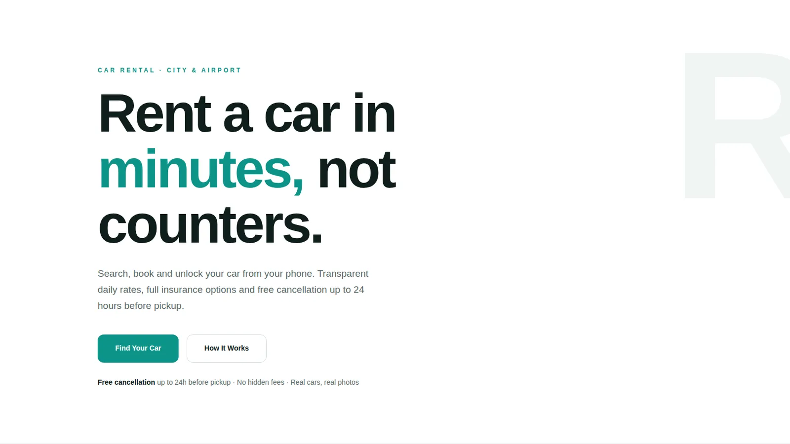
We went flat-minimal: white canvas, oversized Plus Jakarta Sans headlines, generous whitespace and a single ocean-teal accent. The hero leads with the whole value proposition in one line — "Rent a car in minutes, not counters" — backed by a giant ghost "R" and the three trust pillars underneath. Fleet cards use illustrated gradient panels with real category copy, and the four-step process is reduced to Search, Book, Verify, Unlock. A teal CTA band closes with the cancellation promise, the strongest trust signal in rental.
We also ruthlessly simplified the information architecture: fleet, how it works, and a single search entry point. Everything else — insurance detail, fuel policy, licence verification — lives one tap away, never in the way.
Design highlights
Highlights include the monumental headline with a ghost background letter, bordered service grid with hover states, illustrated fleet cards with gradient visuals, and a numbered process band with teal top rules. Microcopy does heavy lifting throughout: "the price at checkout was the price I paid" style honesty, fuel policy in one line, and licence verification explained once.
The ghost background letter gives the hero depth without photography, and the bordered fleet grid borrows credibility from spec-sheet design while staying friendly.
Outcome
The result reads like the product behaves: fast, honest and modern. Visitors understand phone-unlock pickup in seconds, pricing objections are answered before they form, and the path from search to booking is never more than one tap away.
The new site finally explains the product in the time it takes to unlock a car. Support tickets about "where is the counter?" have a clear answer now: there isn’t one.
RoamFree Rentals is a fictional brand created by WebStackRank to demonstrate a car rental website concept. It is a design concept, not a client project.