Wanderly — Travel Agency Website
A warm editorial travel agency website concept for Wanderly — generated destination photography, classic serif headlines, and tailor-made journey design.
Challenge
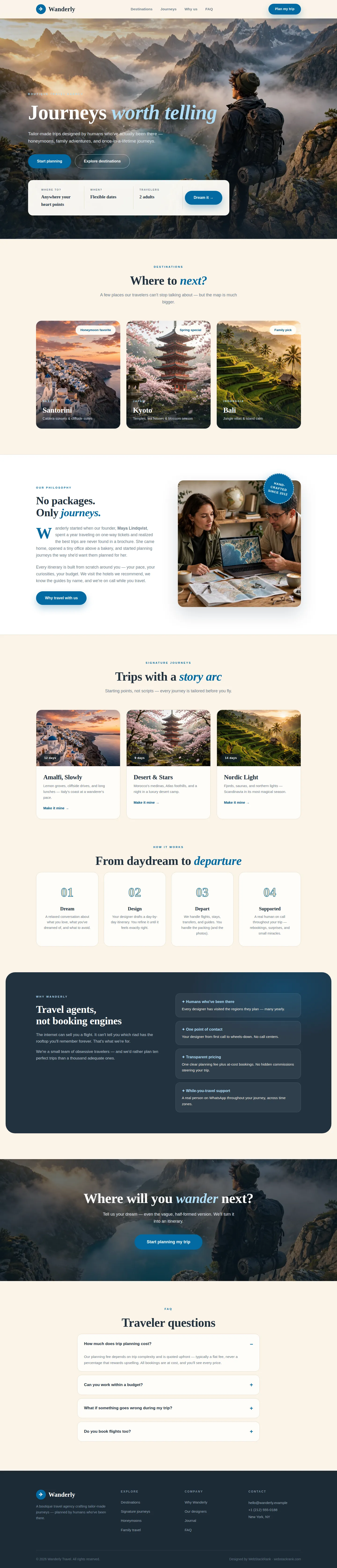
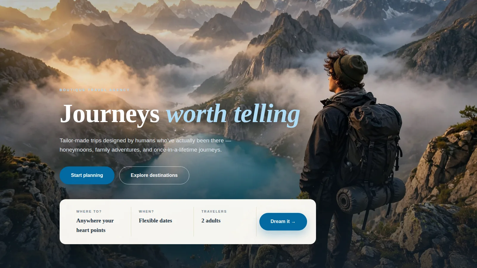
Wanderly is a fictional boutique travel agency — tailor-made honeymoons, family adventures, once-in-a-lifetime journeys — competing on human expertise rather than booking-engine efficiency. The brief specified "warm editorial": full-bleed destination photography, Fraunces serif headlines, a "no packages, only journeys" philosophy. Five AI-generated photos (mountain-lake hero, Santorini, Kyoto, Bali, designer team) had to feel like a cohesive wanderlust portfolio. Copy stayed honest: no invented traveler counts, no fabricated reviews, no discount claims — expertise expressed through specificity.
Approach
We let destinations do the selling: a full-bleed mountain-lake hero with a trip-dreaming widget bar (where to, when, travelers), a three-card destination grid (Santorini, Kyoto, Bali) with editorial captions, a philosophy section with the designer-team photo and a "hand-crafted since 2012" badge, and signature-journey cards with day-count itineraries presented as sample routes. The palette is warm paper with deep teal #0f3d3e and sky-blue accents; the voice is that of a well-traveled friend.
Design highlights
The cinematic hero opens into the destination grid, the "No packages. Only journeys." philosophy band with drop cap, three signature-journey cards (Amalfi, Desert & Stars, Nordic Light) with sample itineraries, a four-step "From daydream to departure" process, and a deep-teal "Travel agents, not booking engines" differentiator band. A full-bleed CTA ("Where will you wander next?") and an accessible FAQ close the page — every itinerary clearly a sample, every claim human-scale.
Outcome
Wanderly shows WebStackRank's travel-design range: the warm-editorial system makes expertise tangible, and the five generated photographs hold a consistent grade from sunrise peaks to cherry blossoms. The trip-widget hero and journey-card patterns are directly reusable for real agency clients. The destination grid and itinerary cards are structured for a CMS, so new places and routes slot in without design work. The philosophy section gives the agency a voice that booking engines can't copy. Honeymoon, family, and group-travel variants reuse the same components and warm editorial voice.
Wanderly is a fictional brand created by WebStackRank to demonstrate a travel agency website concept. It is a design concept, not a client project.