Velocity Cycles — Bike Shop Website
A brutalist-bold bike shop website concept for Velocity Cycles — hard offset shadows, condensed uppercase type, and high-energy cycling retail design.
Challenge
Velocity Cycles is a fictional independent bike shop — sales, servicing, bike fitting, ride club — that needed to feel fast standing still. The brief demanded "brutalist bold": thick black borders, hard offset shadows, skewed labels, condensed uppercase type. Three AI-generated photographs (road cyclist hero, shop interior, workshop) had to sit inside the hard-edged system without softening it. The page needed the full retail arc (hero, marquee, range, workshop, why-us, buying process, ride club, CTA, FAQ) with honest copy: no invented prices, no turnaround-time promises, no sales claims.
Approach
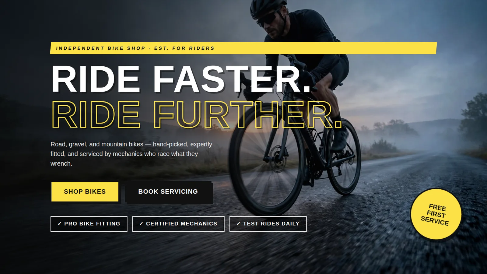
We committed to the brutalist grammar — 5px black borders, 8px hard shadows, Barlow Condensed headlines — and let the photography provide the warmth. The hero layers a skewed yellow eyebrow, a massive two-line headline with outlined second line, and a tilted "Free first service" sticker over the cyclist photo. Green (#16a34a) and yellow (#facc15) accents punch through the black-and-white system. Trust is built through specificity of craft (motion-capture fitting, certified mechanics, test rides) rather than numbers, and the ride-club section sells community, not conversion.
Design highlights
The photographic hero feeds a scrolling category marquee into "Pick your weapon" (road, gravel, mountain, e-bikes), a split workshop section with the shop and workshop photos ("Fit first, buy second" / "Workshop, not waiting room"), a black "Why riders choose us" band, a four-step buying process, a yellow ride-club panel with a tilted weekly-rides card, and a green CTA band. An accessible FAQ ("Asked at the counter") and four-column footer close a page that never sits still.
Outcome
Velocity Cycles proves brutalism can sell: the hard-edged system gives the shop an unmistakable identity, and the honest copy discipline kept every claim about craft and community. The generated photography integrates cleanly into the bordered-card system, and the single-file build ports directly to a real retail site. The ride-club panel and service-tier cards are ready-made modules a real shop could wire to booking software tomorrow.
Velocity Cycles is a fictional brand created by WebStackRank to demonstrate a bicycle shop website concept. It is a design concept, not a client project.