
Suitability has to be visible before the click
Age, preparation time and mess level decide whether an idea is usable right now. If the card does not say them, the parent opens five guides to find one.
Educational resources · family UX
The design question behind Bright Play Days was refreshingly human: what does a parent need when there are ten minutes before dinner and a child is bored? Not a huge list of crafts. Something suited to the child's age, the space, the energy level and the time available. The site is organised around that moment instead of a publishing hierarchy.
Web design company DubaiProject overview
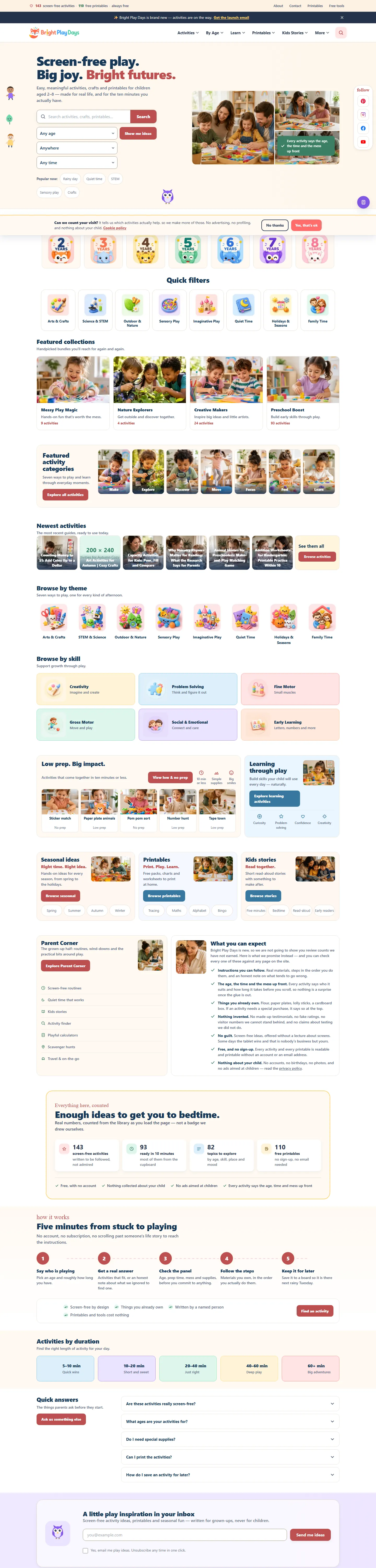
Bright Play Days is a website of screen-free activities, crafts, printables and playful learning ideas for children aged two to eight. The homepage promises something to do in the next ten minutes and is built to keep that promise: find ideas by age, quick filters for any age, ten minutes, fifteen minutes, rainy day and STEM, featured collections, newest activities, and browsing by theme and skill.
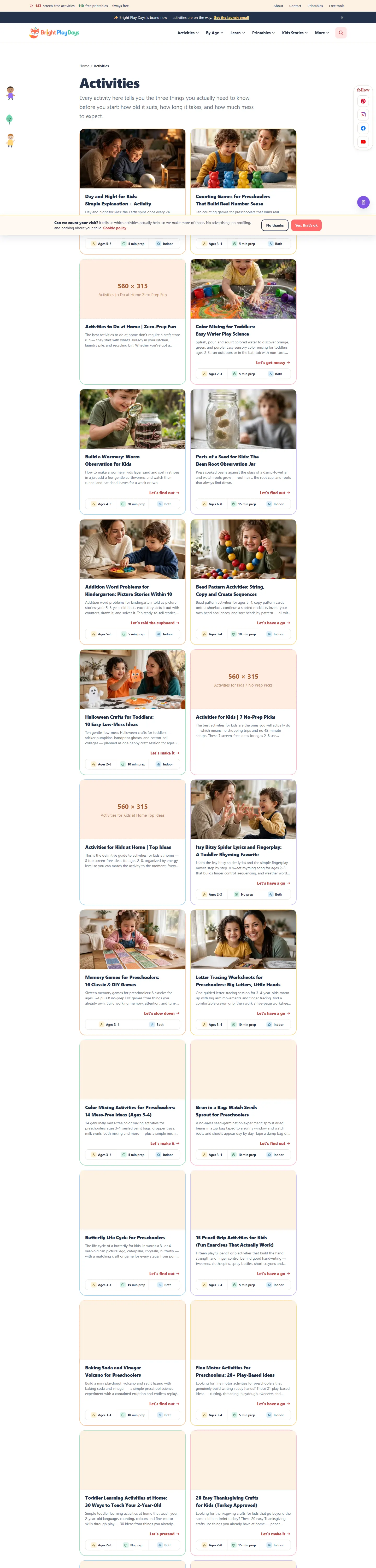
Every activity says the age, the time and the mess up front. That one editorial rule shapes the whole product. A parent scanning on a phone, possibly with one free hand, sees Ages 3–4 and 15 min prep on the card before opening the guide, and the guide itself lists ordinary household materials rather than a shopping trip.
Beyond activities, the site offers 110 free printables (scavenger hunts, routine charts, worksheets) and kids' stories, all without sign-up. It is a Laravel application with server-rendered templates, which keeps the pages fast on the devices parents actually use. The library is still being filled: the homepage carries a banner saying the site is brand new and activities are on the way, and that honesty is kept in this case study.
The original challenge
Most activity websites make parents read a long introduction before revealing the age range, the materials or how messy the idea is. Broad categories fail at the moment that matters: a rainy afternoon, a restaurant table, a road trip.
Age, preparation time and mess level decide whether an idea is usable right now. If the card does not say them, the parent opens five guides to find one.
Rainy day, waiting room, car journey, quiet time: the useful index is the situation the family is in, layered over age and skill.
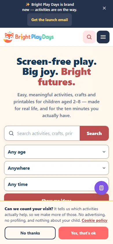
The interface is used on a phone, in motion, often with a child nearby. Filters must be tappable, cards scannable and guides short.
Small children and household materials call for clear age ranges, supervision notes and materials guidance on every activity.
Engineering decisions & solutions
The decisions below turned a content library into a decision tool; where the library is still thin, the outcome says so.
Let a visitor find a suitable activity without reading first.
A parent does not browse a taxonomy; she has a child of a known age, a known amount of time and a known tolerance for mess.
Make age, time and setting the primary navigation, and expose quick filters for the most common moments on the homepage.
Find ideas by age sits at the top of the homepage; quick filters offer any age, ten minutes, fifteen minutes, rainy day and STEM; themes and skills provide the secondary browse.
Multiple overlapping entry points mean the same activity appears in several lists; we accepted the duplication in navigation to avoid duplication of pages.
A parent can reach a shortlist in one tap from the homepage.
Show suitability before the guide opens.
Age and preparation time are the two facts that eliminate most ideas; showing them early saves the most clicks.
Treat age range, prep time and mess level as structured fields on every activity and render them on cards and in listings.
Activity cards and listings display labels such as Ages 5–6 and 20 min prep; the guides repeat them with materials.
Every activity needs these fields filled consistently, which slows publishing slightly and improves the library a lot.
Browsing is faster than an image grid; the rule is applied across the live library.
Make the site useful away from the screen, which is the whole point.
A screen-free site that keeps the child on a screen fails its own brief.
Build a printables library (scavenger hunts, routine charts, worksheets) and a stories section as first-class content types with no sign-up.
The printables index lists 110 free sheets to print with age ranges; stories and worksheets sit alongside activities.
Printables must be tested on real printers and in black and white, which is slower than publishing a post.
110 free printables are live; printer testing across the full set is an open item.
Fit an audience of tired parents and small children.
Friendly visuals and plain language lower the effort of using the site; clear structure keeps it usable with a screen reader or one thumb.
Short labels, large tap targets, simple colour coding for age groups and plain-language headings.
Responsive templates with tappable filter chips, scannable cards and short guides; age groups are consistent labels throughout.
A playful palette needs careful contrast management to stay readable.
The site works on a phone with one hand; a formal accessibility audit is a recommendation.
The library is growing; the site should not pretend otherwise.
A brand-new site that implies a complete library disappoints; one that says it is new and growing sets the right expectation.
Keep the brand-new banner while the library fills, and show real counts rather than inflated ones.
The homepage banner says the site is brand new and activities are on the way; category pages show their own activity counts.
The banner will need to be removed once the library is complete, and placeholder social links should be removed rather than left as not set up.
Expectations are honest; the clean-up is listed in the open items.
Main features
Everything below is visible on brightplaydays.com as of the review date; counts are the site's own labels.
Technical architecture
Bright Play Days is a Laravel application. Activities, printables and stories are content types with structured fields (age range, prep time, mess level, theme, skill), which is what makes the quick filters and card labels reliable rather than editorial guesswork.
Pages are rendered on the server and kept light; the printables are served as downloadable sheets.
What we deliberately leave out: hosting, analytics and email provider configuration are not described.
| Layer | What is in place |
|---|---|
| Backend | Laravel (PHP) with activity, printable and story content types |
| Data | MySQL with structured fields for age range, prep time, mess level, theme and skill |
| Frontend | Server-rendered Blade templates, responsive layout, tappable filter chips |
| Discovery | Age navigation, quick filters, theme and skill hubs, featured and newest collections |
| Resources | 110 printable sheets with age ranges, served as downloads without sign-up |
| Content model | Age, time and mess as required fields so every card can show them |
| Newsletter sign-up for new activities and printables |
User experience & responsive design
Genuine screenshots of the public site captured on 23 October 2026. Hover and click any image to open it in the viewer; click again for actual size.
The homepage asks who is playing and how long you have, then shows ideas; the catalogue is the second screen, not the first.
Age and prep time sit on every card so the eye reads suitability first and the picture second.
Filter chips and cards are sized for thumbs; guides are short and materials lists are near the top.
Headings say what the activity is and what it teaches, without education jargon.
Printables are previewed with their age range and are designed to print cleanly, including in black and white.
The brand-new banner and visible category counts tell a parent what to expect from a growing library.
Technical challenges & resolutions
Each row records how it was verified and what remains open. Items marked as recommendations have not been implemented yet.
| Challenge | Root cause / constraint | Solution | Verification | Result or remaining limitation |
|---|---|---|---|---|
| Parents could not judge suitability from a grid | Image-first cards with no metadata | Structured age, time and mess fields rendered on every card | Cards and listings checked on the review date | Delivered across the live library |
| Browsing by topic missed the real moment | Topic-only navigation | Age navigation and quick filters for common situations | Navigation review on mobile | Delivered; situation coverage will grow with the library |
| Screen-free site kept children on screens | Articles only | 110 free printables and stories as content types | Printables index present with age ranges | Live; printer testing of the full set is open |
| Launch messaging contradicts the live library | Brand-new banner kept while content filled | Remove the banner once content availability is confirmed | Banner visible on the review date | Open item (recommendation) |
| Placeholder social links | Channels planned but not created | Replace with working links or remove the entries | Footer shows not-set-up placeholders on the review date | Open item (recommendation) |
Estimated market development cost
What a comparable family resource site would cost to commission in 2026: parent-journey research, activity discovery with structured filters, article and age templates, a printable library and accessibility QA. Editorial estimates for comparable work, not quotes.
Comparable scope, 2026 market range
AED 25,000 – 80,000
Roughly 170–350 hours of design, engineering, QA, documentation and deployment at a blended agency rate; scope-dependent.
Writing the activities and designing the printables is editorial work outside the build estimate.
Illustrative market development estimate for a comparable scope. This is not the actual project invoice, historical development cost or amount charged to a client.
| Comparable delivery component | Estimated range (AED) |
|---|---|
| Research, information architecture and parent journeys | 5,000 – 14,000 |
| Activity discovery, categories and filters | 8,000 – 25,000 |
| Article and age-specific templates | 6,000 – 18,000 |
| Printable and resource library | 3,000 – 12,000 |
| Accessibility, QA and launch | 3,000 – 11,000 |
Component ranges are illustrative phase allocations, not measured hours or invoices. Third-party subscriptions, paid APIs, content production, hosting and marketing are excluded. Market context: Clutch web design pricing guide (2026), Dubai website cost comparison (Sept 2026) — editorial estimates by WebStackRank, not independently obtained quotes.
Results & outcomes
What a visitor can confirm today. Usage figures are not published.
Age navigation, quick filters for common moments, theme and skill hubs, featured and newest collections.
Age range and prep time shown before a guide opens; materials are household items.
Scavenger hunts, routine charts and worksheets with age ranges, downloadable without sign-up.
Age, time, mess, theme and skill are fields, which is why filtering and labels are reliable.
Fast on mobile data, with a one-hand interface.
Category counts and a brand-new banner tell parents what exists today.
What this page does not claim: traffic, engagement, or the total number of activities beyond the counts the site shows on its own pages. The 110 printables figure is the site's label on the review date.
Lessons learned
Project status
Live · library still growing
brightplaydays.com is online with activity guides, age and quick filters and 110 free printables. The homepage still carries a brand-new banner saying activities are on the way, and the social links are placeholders; both are listed as open items below. The counts shown on the site are its own labels on the review date.
Status and figures reviewed on 23 October 2026 against the public site. Bright Play Days is an in-house product owned and operated by the WebStackRank founder.
Related projects
Whether you're planning a booking platform, SaaS product, business website or custom application, WebStackRank can help you turn the idea into a practical, maintainable digital product.
How would you like to reach us?
Thanks for chatting!
It was lovely to connect. Come back anytime — our starter packages and their 3 months free maintenance are on the pricing page whenever you're ready. See you again!
See the pricing page