
Twelve topics, one clear way in
Skincare, nails, hair, face yoga, mature skin, outfits and more all deserve a home, but a reader should not face twelve equal choices. The homepage needs a hierarchy: start here, then explore.
Content publishing · editorial UX
The Fern Edit was built for a different browsing mood from a booking system or a calculator. A reader wants inspiration, but also a routine she can follow or a plain answer to a skincare question. The site had to feel warm and visual while keeping guides readable, honest about what works and clear that it is educational, not medical.
Web design company DubaiProject overview
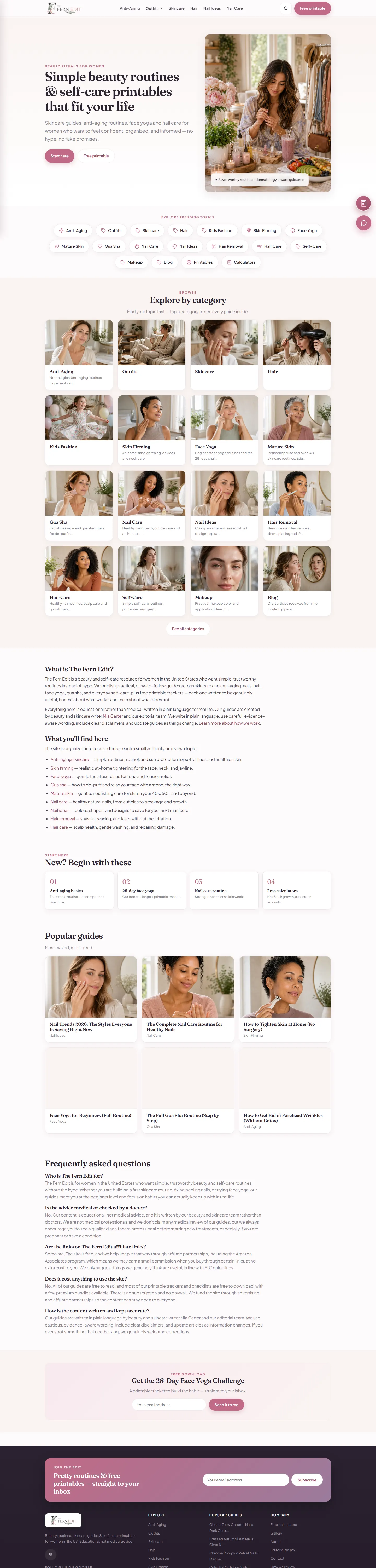
The Fern Edit publishes beauty and self-care guides: skincare and anti-ageing routines, nail care and nail ideas, hair care and hair removal, face yoga and gua sha, mature-skin and perimenopause routines, outfits and a small kids-fashion corner, plus free printable trackers and checklists. The homepage introduces twelve topic hubs, a Start Here path and featured guides so a first-time reader knows where to begin.
The product problem is editorial focus. Beauty content competes in crowded search results and on visual discovery channels, and sites in the category tend to repeat the same advice under different headlines. The design groups related guides into hubs, surfaces a few curated entry points and keeps every article template consistent, so breadth reads as a library rather than a feed.
Trust is part of the specification. Skin-related advice can be mistaken for medical guidance, so the site states on every page that its content is educational rather than medical, publishes an editorial policy with a correction process, names its editorial attribution and discloses affiliate links. The platform itself is a Laravel application with Bootstrap on the front end, chosen so the editorial team can publish quickly without a developer in the loop.
The original challenge
Too many articles can fragment into isolated posts; too many menu items overwhelm a reader on a phone; and skin advice carries a trust responsibility that a typical lifestyle blog ignores.
Skincare, nails, hair, face yoga, mature skin, outfits and more all deserve a home, but a reader should not face twelve equal choices. The homepage needs a hierarchy: start here, then explore.
Editorial photography sets the tone, yet the value is in the routine or the checklist. Layouts have to carry both without the imagery swallowing the text on a small screen.
Disclaimers, named attribution, a review and correction process and affiliate disclosures must be visible and consistent, not buried in a footer link.
An article is read once. Printables, a 28-day challenge and a newsletter turn a visit into something the reader uses.
Engineering decisions & solutions
The decisions below are editorial as much as technical; on a publishing site the two are the same problem.
Organise a growing body of guides so that related advice stays together.
A reverse-chronological feed hides the best guides behind the newest ones and makes the site look like a stream of unrelated posts.
Define a small set of durable hubs (anti-ageing, skincare, hair, nail care, face yoga, gua sha, mature skin, outfits and so on), give each a landing page, and make every article belong to one.
The homepage shows the twelve hubs with featured guides per hub; category pages collect their articles; the blog remains available for browsing by date.
Hubs need enough content to feel alive; a thin hub is worse than no hub, so categories were launched only when they had substance.
A reader can move from a broad interest to a specific routine in two clicks; new articles slot into an existing structure instead of competing with it.
Help a first-time visitor who does not yet know what she is looking for.
Without a guided entry, the homepage becomes a wall of equal cards and the bounce is immediate.
Add a Start Here route, feature a handful of guides per hub and promote one recurring programme, the 28-day face yoga challenge with a printable tracker.
Start Here appears in the primary navigation; featured guides are curated per hub; the challenge is promoted on the homepage with its tracker.
Curation is ongoing editorial work rather than a one-off build task.
The homepage reads as an invitation rather than an index.
Make the site's standards legible to readers and to search engines.
Beauty guidance borders on health guidance; readers and reviewers need to know who writes, how it is researched and that it is not medical advice.
Publish an editorial policy page covering standards, authorship, research, first-hand testing, review, corrections and affiliate independence; repeat the educational-not-medical statement sitewide; name the editorial attribution.
The editorial policy page is live with a last-updated date, the About page explains who writes, the footer and every article carry the educational-not-medical line, and affiliate links are disclosed on a dedicated page.
Attribution must stay genuine; we do not add credentials the writers do not hold, and the policy promises only what the team actually does.
Trust signals exist as real pages and processes; any claim about traffic or rankings stays out of them.
Give readers something to use, not just read.
A checklist or tracker is saved, printed and returned to; an article is forgotten.
Treat printables as a content type with its own index and promotion, and pair programmes like the face yoga challenge with a downloadable tracker.
A Self-Care Printables section lists free downloads; the 28-day challenge links to its tracker; the newsletter offers routines and printables by email.
Printables need design care and print testing, which is slower than writing a post.
The site has a reason to be bookmarked; download and subscription figures are not published here.
Let non-developers publish consistently.
A publishing site lives or dies on cadence; if every article needs a developer, cadence collapses.
Build on Laravel with a conventional article model, category and tag structure and server-rendered Bootstrap templates.
Articles, categories, printables and policy pages render from one layout with consistent components; the team publishes without touching code.
A custom build costs more up front than a hosted blog platform; the gain is control over templates, performance and disclosures.
Consistent pages across hubs and a template the team can keep filling.
Main features
Everything below is visible on thefernedit.com as of the review date.
Technical architecture
The Fern Edit runs on Laravel with Bootstrap templates. Articles, categories, printables and policy pages are content types rendered through one layout, which is what keeps twelve hubs looking like one site.
Performance work focuses on images: editorial photography is sized for its slot and lazy-loaded below the fold, so the visual mood does not cost the reader on a phone.
What we deliberately leave out: the email provider, analytics configuration, affiliate programmes and hosting are not described.
| Layer | What is in place |
|---|---|
| Backend | Laravel (PHP) with article, category, tag and printable content types |
| Data | MySQL for articles, categories, printables and subscriber sign-ups |
| Frontend | Server-rendered Blade templates on Bootstrap; one layout across hubs, articles and resources |
| Navigation | Start Here, twelve hubs, printables index, blog archive, search |
| Trust pages | Editorial policy, About, affiliate disclosure, educational-not-medical statement sitewide |
| Resources | Printable PDFs and challenge trackers served as downloads |
| Newsletter sign-up form with routines and printables |
User experience & responsive design
Genuine screenshots of the public site captured on 23 October 2026. Hover and click any image to open it in the viewer; click again for actual size.
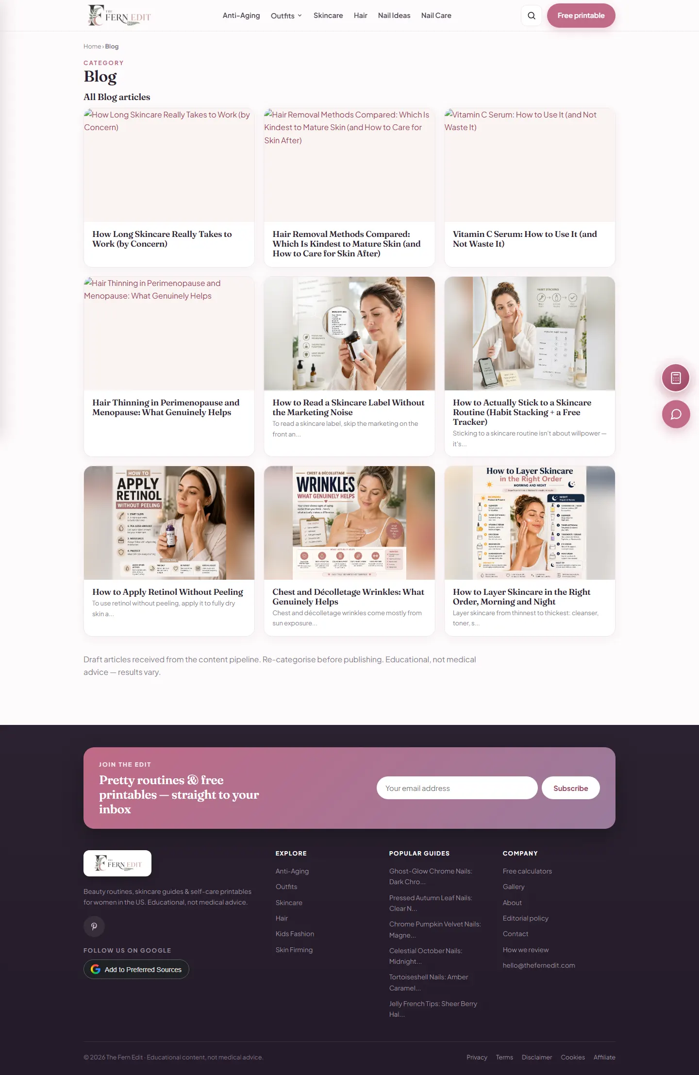
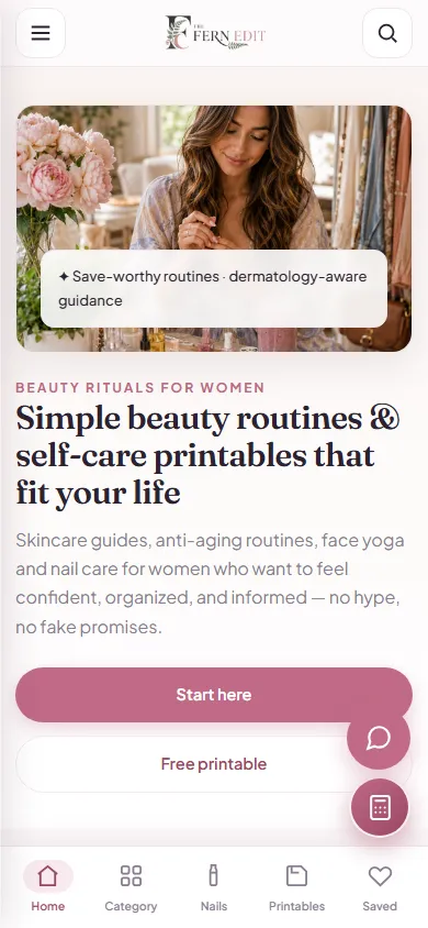
The homepage leads with topics and a Start Here path; the blog archive is available but is not the front door.
Editorial images set the mood in fixed, sized slots; the routine or checklist is always the widest readable column on mobile.
Short sections, descriptive headings and consistent article templates keep long routines scannable.
The educational-not-medical line sits in the footer and on content pages rather than only in a policy document.
Printables and the 28-day challenge are promoted as things to do, which gives the visual design a practical anchor.
Headings follow the outline, images carry descriptive alt text, forms are labelled, and contrast on text over photography is managed with overlays.
Technical challenges & resolutions
Each row records how it was verified and what remains open. Items marked as recommendations have not been implemented yet.
| Challenge | Root cause / constraint | Solution | Verification | Result or remaining limitation |
|---|---|---|---|---|
| Content fragmented into isolated posts | Early chronological publishing with no hubs | Twelve durable topic hubs with landing pages; every article assigned to one | Hub and category pages reviewed; articles checked for a single home | Delivered; hubs are kept alive editorially |
| First-time readers had no starting point | A homepage of equal cards | Start Here path, curated featured guides, a promoted challenge | Navigation review on mobile and desktop | Delivered; engagement figures are not published |
| Skin advice could be read as medical guidance | No consistent disclosure | Educational-not-medical statement sitewide, editorial policy, About, affiliate disclosure | Pages present and linked on 23 October 2026 | Delivered; author credentials are kept to what is genuine |
| Internal pipeline notes visible on the blog index | Draft-stage editorial notes carried into a public listing | Remove the note once the articles have been re-categorised | Visible on the review date | Open item (not yet fixed) |
| Heavy photography on mobile | Full-size editorial images in every card | Sized image slots with lazy loading | Throttled mobile profiling | Improved; Core Web Vitals reporting is a recommendation |
Estimated market development cost
What a comparable editorial platform would cost to commission in 2026: an editorial design system, CMS-style content types with hubs and article templates, printables and a small set of utilities, technical SEO and launch QA. Editorial estimates for comparable work, not quotes.
Comparable scope, 2026 market range
AED 20,000 – 70,000
Roughly 140–300 hours of design, engineering, QA, documentation and deployment at a blended agency rate; scope-dependent.
Content production (writing, photography, printable design) is excluded from the build estimate.
Illustrative market development estimate for a comparable scope. This is not the actual project invoice, historical development cost or amount charged to a client.
| Comparable delivery component | Estimated range (AED) |
|---|---|
| Editorial design system and visual structure | 5,000 – 16,000 |
| CMS, category hubs and article templates | 7,000 – 20,000 |
| Printables and utility functionality | 3,000 – 11,000 |
| Technical SEO, accessibility and performance | 2,000 – 10,000 |
| QA, migration and launch | 3,000 – 13,000 |
Component ranges are illustrative phase allocations, not measured hours or invoices. Third-party subscriptions, paid APIs, content production, hosting and marketing are excluded. Market context: Clutch web design pricing guide (2026), Dubai website cost comparison (Sept 2026) — editorial estimates by WebStackRank, not independently obtained quotes.
Results & outcomes
What a visitor can confirm on the site today. Traffic, rankings and Pinterest performance are not published here because they have not been verified for publication.
Twelve topic hubs, a Start Here path, featured guides, a blog archive and search.
Free self-care printables and a 28-day face yoga challenge with a printable tracker.
An editorial policy with a last-updated date, an About page, affiliate disclosures and an educational-not-medical statement on every page.
Consistent article, hub and resource templates on Laravel and Bootstrap; publishing needs no developer.
Sized, lazy-loaded photography and readable guide layouts on small screens.
A newsletter offering routines and printables by email.
What this page does not claim: organic traffic, search positions, Pinterest reach or author qualifications beyond what the About page states. Topical depth is not presented as proof of growth.
Lessons learned
Project status
Live editorial platform
thefernedit.com is live with category hubs, a blog, free printables, an About page, an editorial policy and affiliate disclosures. Editorial clean-up of the blog index is still in progress (see open items).
Status and figures reviewed on 23 October 2026 against the public site. The Fern Edit is an in-house publishing brand owned and operated by the WebStackRank founder.
Related projects
Whether you're planning a booking platform, SaaS product, business website or custom application, WebStackRank can help you turn the idea into a practical, maintainable digital product.
How would you like to reach us?
Thanks for chatting!
It was lovely to connect. Come back anytime — our starter packages and their 3 months free maintenance are on the pricing page whenever you're ready. See you again!
See the pricing page