Archform Studio — Architecture Firm Website
A precise Swiss-grid website for Archform architecture studio — project index, drawing-led philosophy, principles and a clear commissioning process.
Challenge
Archform's work is rigorous — precise plans, honest structure, buildings designed in section — but its old website was a generic portfolio grid that made a cultural pavilion look like a kitchen extension. Founder Henrik Vane wanted a site that thought the way the studio draws: systematic, precise, and confident enough to let the work speak in an index rather than a slideshow.
Approach
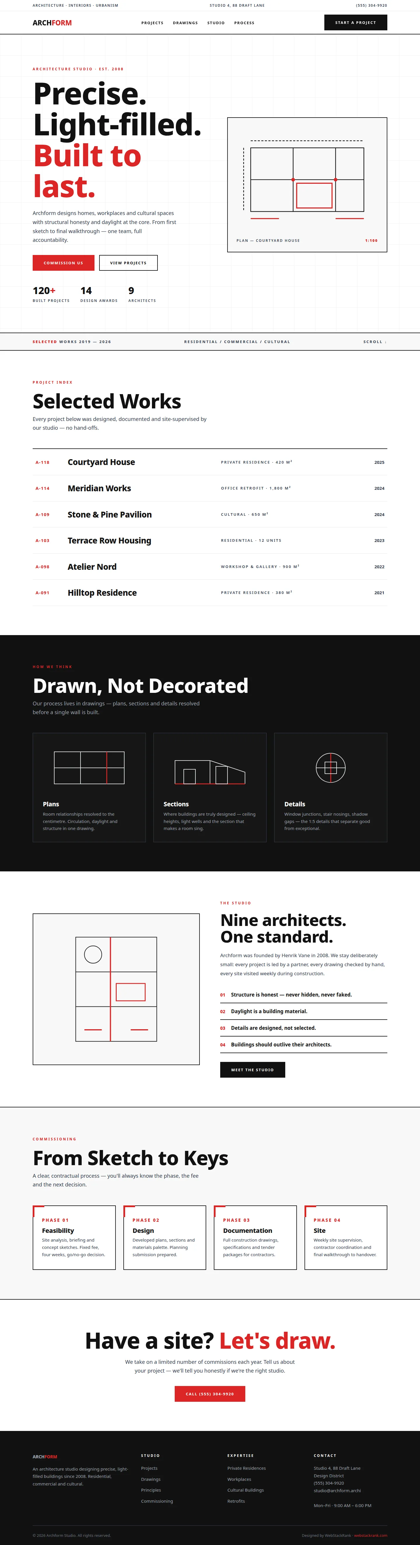
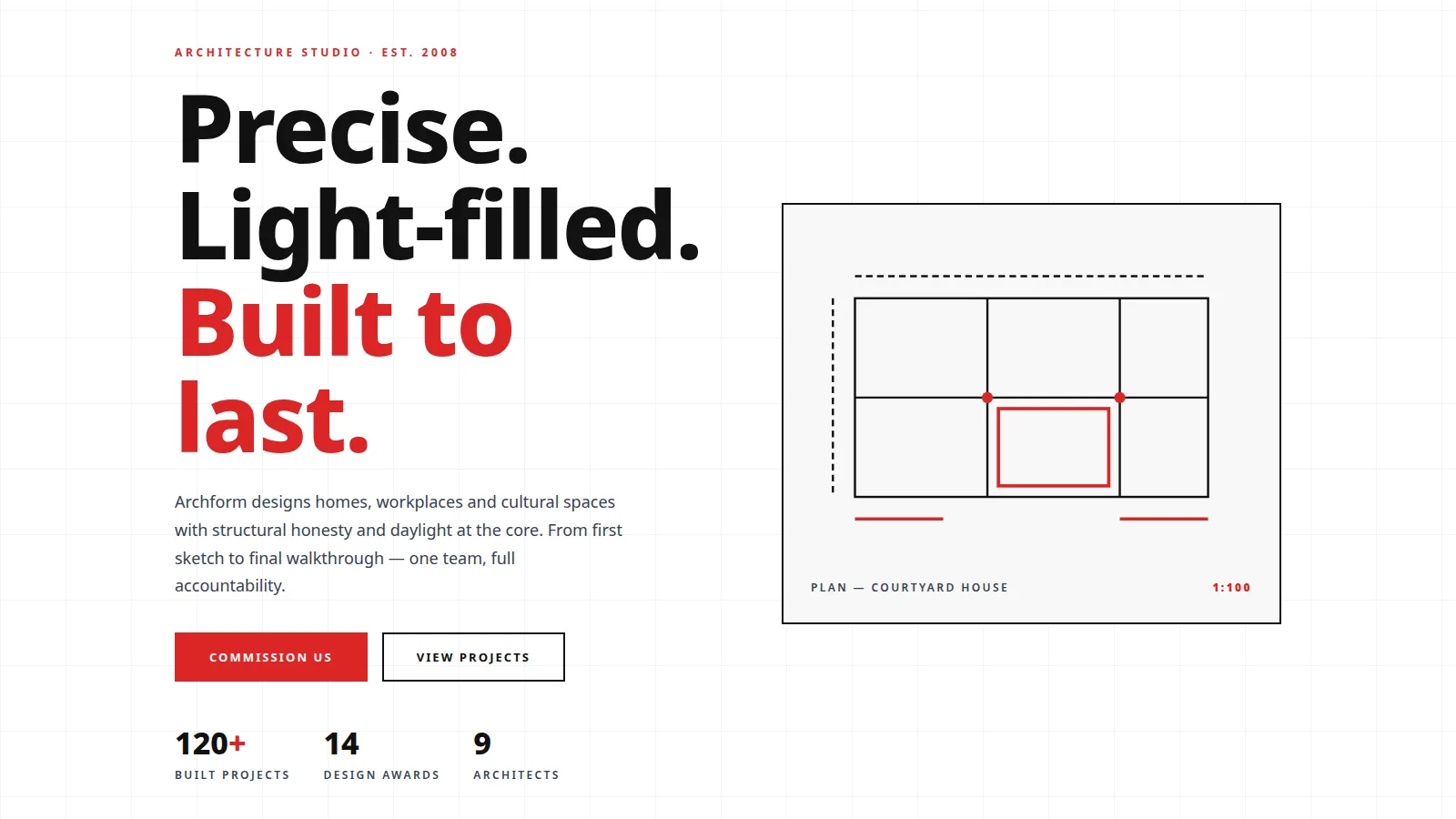
We built a strict Swiss-grid language: white surfaces, hairline rules, graphite text, and a single signal-red reserved for emphasis — the red of a markup pen. Typography is Archivo throughout, set large and tight. Instead of image galleries, the project index lists six commissions as numbered rows (A-118, A-114…) with type and year — the way architects actually reference their work. A "drawn, not decorated" section presents plans, sections and details as SVG line drawings, turning the studio's method into the visual identity. The commissioning process is laid out as four contractual phases with honest framing about fees and decisions.
Design highlights
The hero pairs a three-line manifesto headline with an SVG plan drawing in a bordered "blueprint" card, captioned with scale like a real drawing. A project ticker bar ("Selected works 2019–2026") introduces the index. The dark drawings section inverts the palette for the plan/section/detail cards. The studio section lists four numbered principles as a manifesto, and red corner ticks on the process cards echo drawing registration marks. Every red element on the site earns its place — nothing decorative, everything deliberate.
Outcome
The site now functions as a credential in itself: prospective clients experience the studio's precision before the first meeting. The index format and phased commissioning process pre-qualify serious inquiries and reduce vague briefs. It's a website that could only belong to an architecture practice — which was precisely the brief.
Archform Studio is a fictional brand created by WebStackRank to demonstrate a architecture firm website concept. It is a design concept, not a client project.