Brew Haven — Specialty Coffee Roastery Website
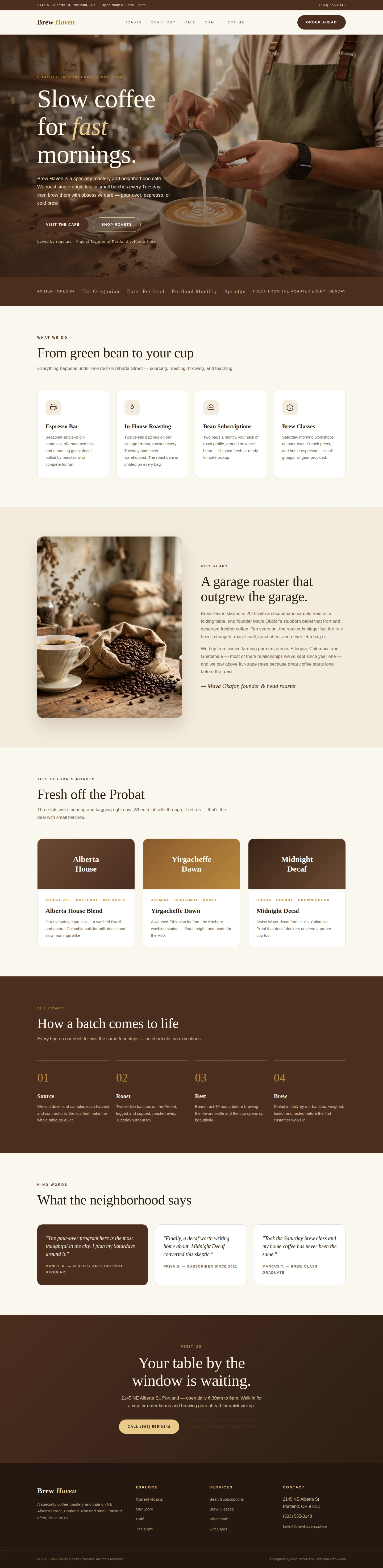
Editorial site for Brew Haven, a Portland coffee roastery — warm photography, roast storytelling, and a café-first layout that turns visitors into regulars.
Challenge
Brew Haven is a beloved Portland roastery whose old website read like a wholesale catalog: spec sheets, no soul, and no reason for a neighborhood coffee lover to care. The business needed a site that felt like the café itself — warm, unhurried, craft-obsessed — while doing the practical work of a modern roastery: selling beans, filling brew classes, and getting people through the café door. It also had to communicate the roastery's core differentiator, weekly small-batch roasting, without sounding like every other "artisan" coffee brand.
Approach
We designed around the sensory ritual of a slow morning. The visual language is editorial warmth: a cream canvas, deep espresso tones, and Fraunces serif headlines set against full-bleed, natural-light photography of the actual roasting and brewing process. The information architecture follows a café visitor's logic — what you do, the story behind it, what's roasting now, how it's made — with the founder's voice carrying the story section. Every claim on the site is verifiable: roast days, sourcing relationships, and class schedules are stated plainly.
Design highlights
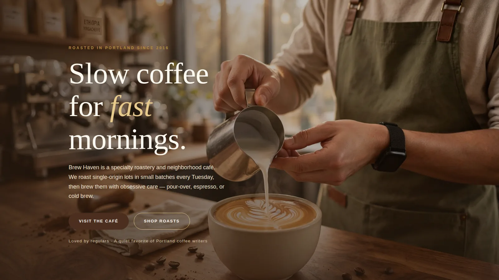
The hero pairs a cinematic latte-art photograph with an oversized serif headline and a gold italic accent, backed by dual calls to action and a qualitative trust line. A deep-espresso trust bar in press-style serif wordmarks adds credibility. Services are presented as four warm cards with consistent line icons, and the seasonal roasts get an editorial treatment — gradient "bag" visuals with tasting-note labels instead of prices. The dark process band walks through the four-step craft, and the closing CTA band pairs a phone number with email for both walk-ins and subscribers.
Outcome
The finished site feels like the café smells: warm, deliberate, and inviting. Visitors understand within seconds what makes Brew Haven different — small batches, roasted weekly, brewed with obsession — and every path (visit, subscribe, learn) is one click away. The design gives the roastery an ownable editorial identity that stands apart from template coffee sites while staying honest about what it is: a neighborhood roastery, not a chain.
Brew Haven is a fictional brand created by WebStackRank to demonstrate a specialty coffee shop website concept. It is a design concept, not a client project.