Sakura — Omakase Sushi Bar Website
Minimal zen website for Sakura, a Seattle omakase counter — twelve seats, eighteen courses, and a reservation flow as quiet and deliberate as the dining room.
Challenge
Sakura is a twelve-seat omakase counter in Belltown with two seatings nightly — a restaurant that sells scarcity, ritual, and trust. Its website needed to feel like the counter: quiet, precise, and confident, with no menu to show and no noise to make. The design had to communicate the arc of the eighteen-course evening, introduce Chef Tanaka's twenty-year craft, and handle reservations for a room that books out thirty days ahead — all while honoring Japanese aesthetic restraint rather than performing it.
Approach
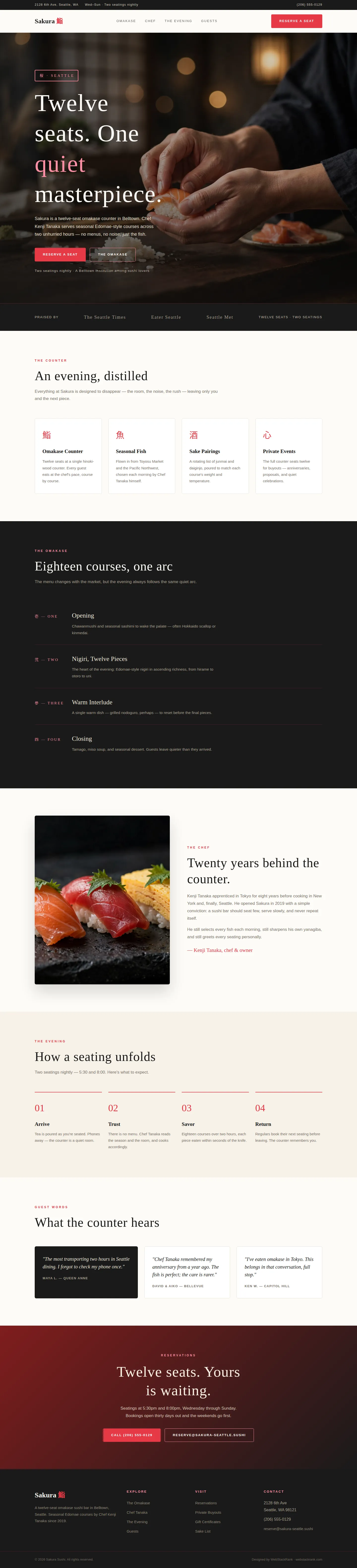
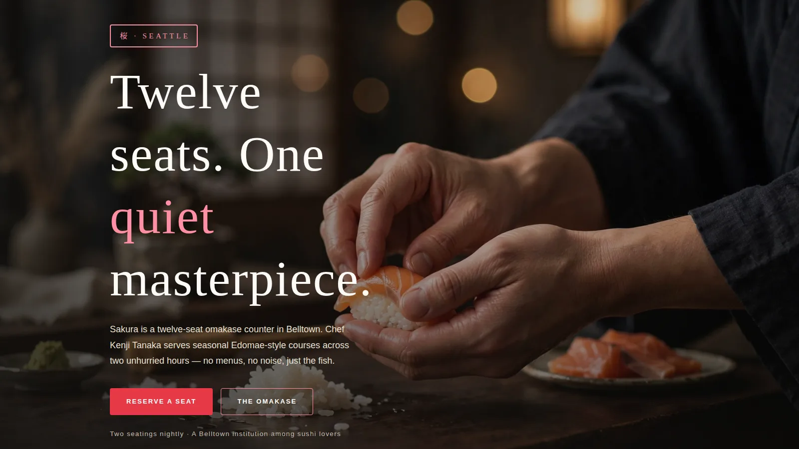
We designed with editorial zen discipline: rice-white backgrounds, ink-black sections, vermillion used sparingly like a hanko seal, and Noto Serif JP headlines with generous whitespace. The hero uses a cinematic photograph of the chef's hands at the counter with a seal-style badge. The omakase section presents the evening as four numbered movements (using Japanese numerals), the chef story is told plainly with a portrait-style image, and the reservation CTA is calm and direct — matching how the restaurant actually communicates.
Design highlights
The hero pairs dark counter photography with a vermillion seal badge and an oversized serif headline, backed by dual CTAs. The omakase arc is the site's centerpiece: four courses on deep ink with Japanese numeral labels, telling the evening's story without listing a single dish price. Service cards use kanji characters as iconography — an authentic, restrained touch. The chef section is split-layout with a clean framed photograph, and the four-step "evening" band (Arrive, Trust, Savor, Return) sells the ritual before asking for the booking.
Outcome
The site feels like the restaurant: quiet, confident, and complete. Visitors understand exactly what an evening at Sakura is — eighteen courses, two hours, no menu — and the reservation path is frictionless. The restraint is the luxury here; nothing on the site shouts, which is precisely why the right guests lean in.
Sakura is a fictional brand created by WebStackRank to demonstrate a sushi bar website concept. It is a design concept, not a client project.