Hoppy Tap Brewing Co. — Craft Brewery Website
Bold brutalist website for Hoppy Tap Brewing Co. of Denver — hard-shadow cards, a scrolling tap marquee, and a taproom-first layout built for beer lovers.
Challenge
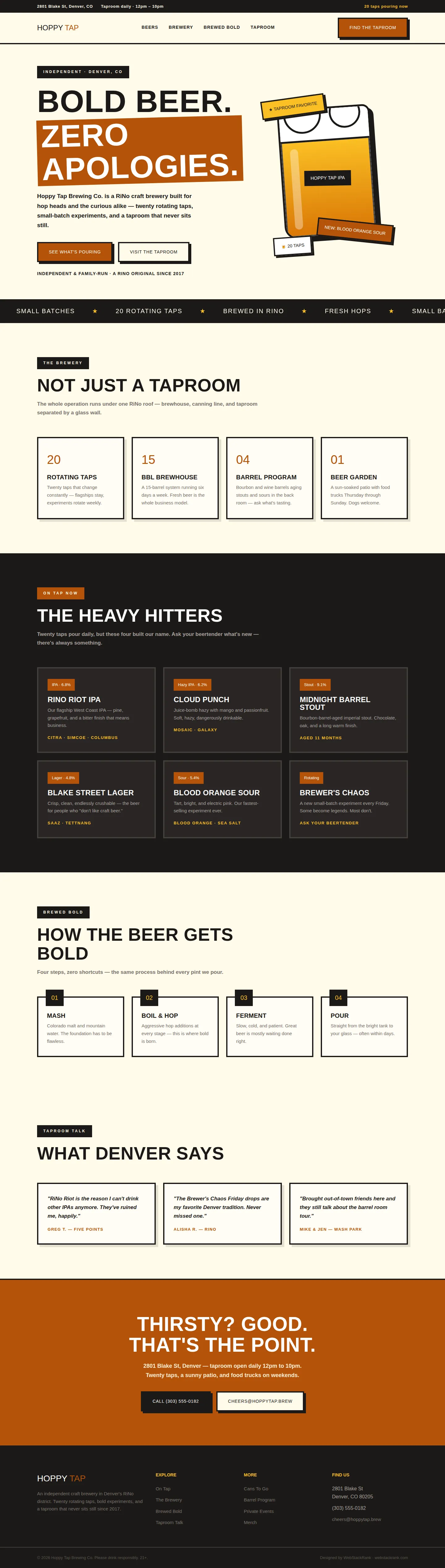
Hoppy Tap is a RiNo brewery with twenty rotating taps and a "zero apologies" attitude, but its website was timid: stock photos, tiny type, and nothing of the taproom's energy. The brewery needed a site as bold as its IPA — one that shows what's pouring now, tells the brewing story, and gets people to Blake Street. The design had to feel like craft beer culture (loud, proud, a little rough around the edges) while staying clean enough to actually use.
Approach
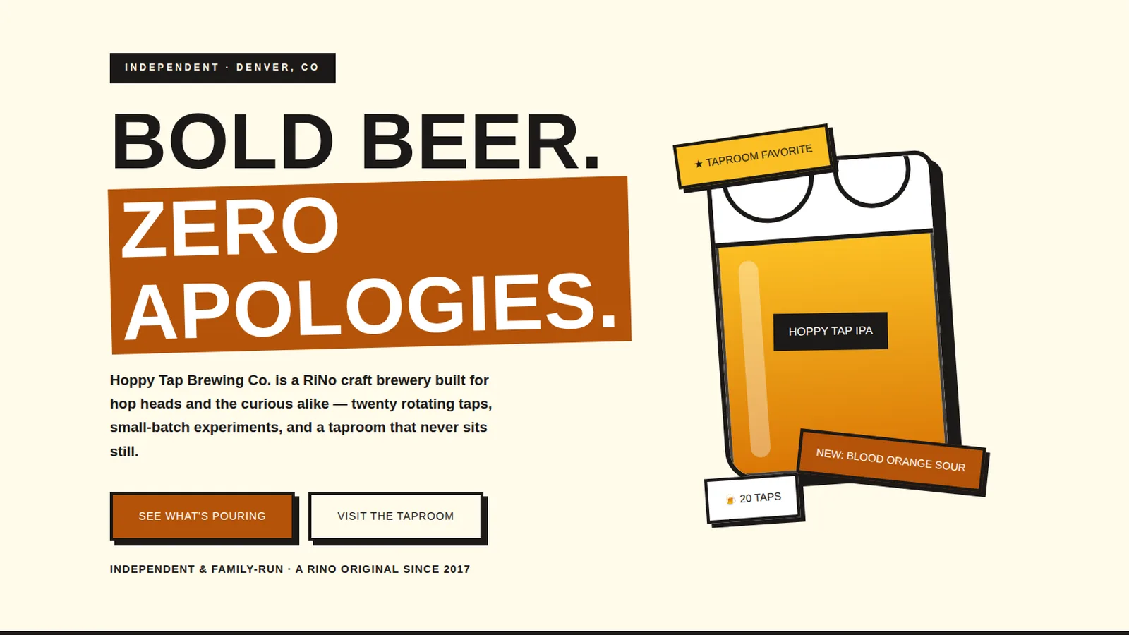
We went full brutalist-bold with craft: cream backgrounds, thick black borders, hard offset shadows, copper accents, and Archivo Black headlines in all caps. The hero is built in pure CSS — a giant illustrated beer mug with foam, a "Hoppy Tap IPA" label, and rotated sticker badges. A scrolling marquee shouts the brewery's credentials, the beer list reads like a tap board with hop bills, and the dark "on tap now" section gives the flagships the spotlight they deserve. Everything is chunky, tactile, and unmistakably a brewery site.
Design highlights
The hero centers a pure-CSS beer mug illustration — foam, gradient beer, glossy highlight, branded label — flanked by rotated sticker badges ("Taproom favorite," "New: Blood Orange Sour"). The scrolling marquee adds motion and attitude. Beer cards carry ABV badges and hop bills like a real tap list, and the "Brewer's Chaos" Friday experiment gets its own card. Hard shadows and thick borders are used consistently, and the copper CTA band closes with the brand voice: "Thirsty? Good. That's the point."
Outcome
The site now has the brewery's personality in every pixel — bold, a little loud, and completely ownable. Visitors can see what's pouring, learn the brewing philosophy, and find the taproom without wading through generic craft-beer clichés. The pure-CSS illustration approach keeps it fast and distinctive, proving a brewery site doesn't need a single stock photo to feel alive.
Hoppy Tap Brewing Co. is a fictional brand created by WebStackRank to demonstrate a craft brewery website concept. It is a design concept, not a client project.