Approach
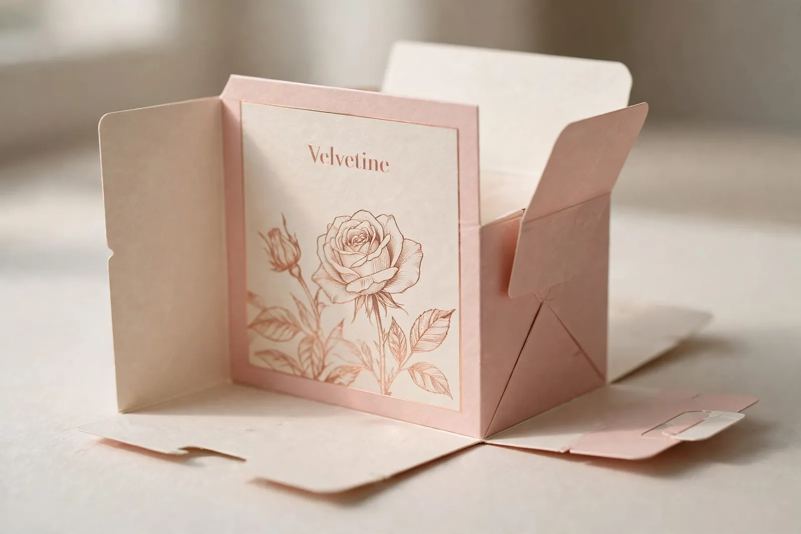
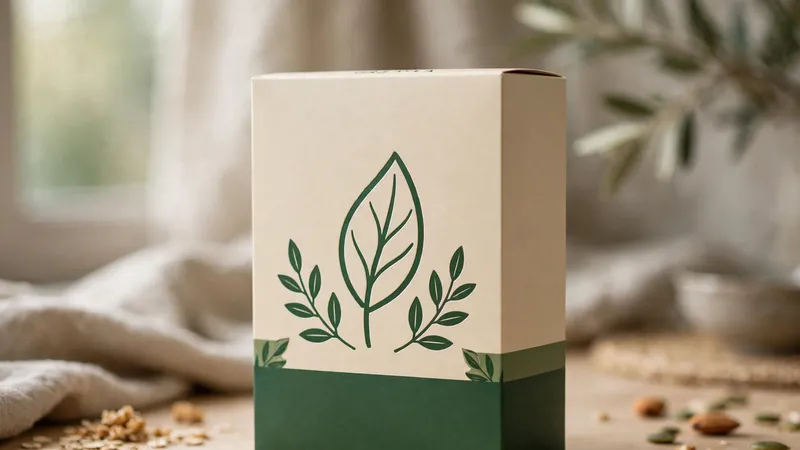
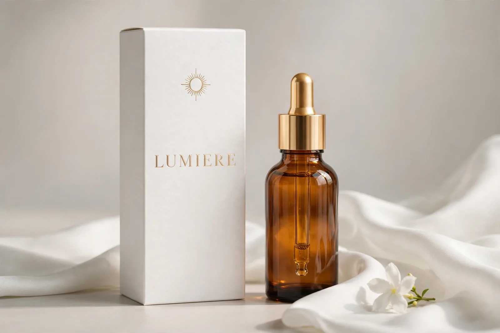
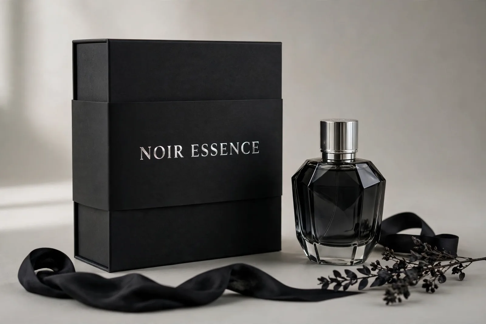
We designed the packaging as a material-first story, presented in the order the box actually comes to life. The set LEADS with the flat, open, fully-printed die-cut sheet — the packaging material itself, designed: blush pink board carrying the refined serif Velvetine wordmark in rose gold on the front panel, a delicate rose blossom line-art motif, rose-gold rules framing every panel, cream side panels with fine-print usage microcopy, full ingredients and barcode in place on the base panel, fold creases and glue flaps visible. Then a mid-folding view shows the sheet becoming a box (side walls raised, flaps open), followed by the assembled 3/4 hero shot beside the frosted cream jar and a rose-gold foil close-up. The restraint is the luxury — one blossom, one wordmark, and a two-tone blush-and-cream architecture.


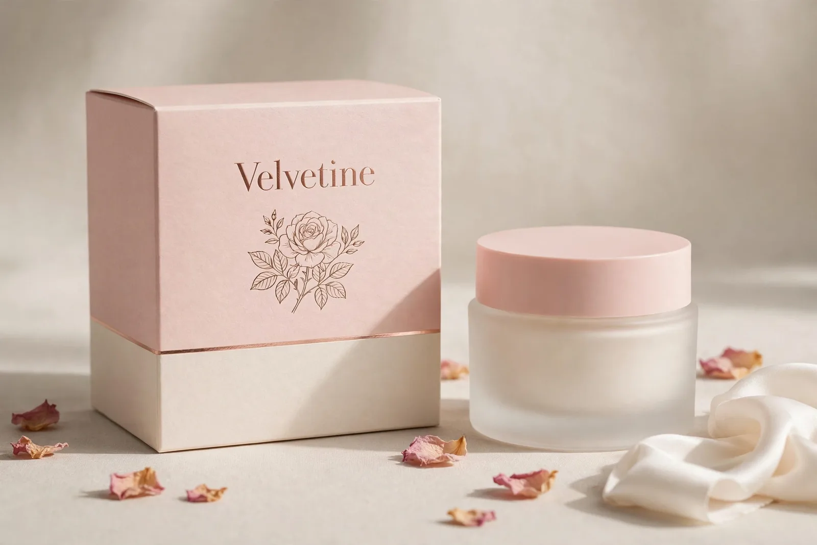
 Flat printed components
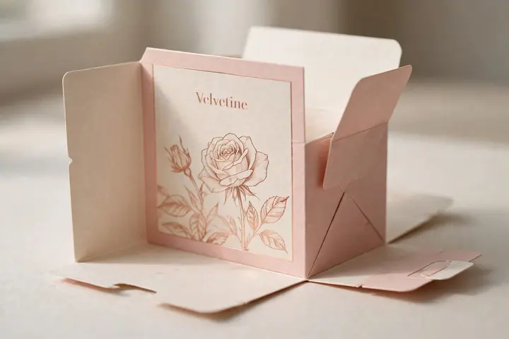 Mid-assembly
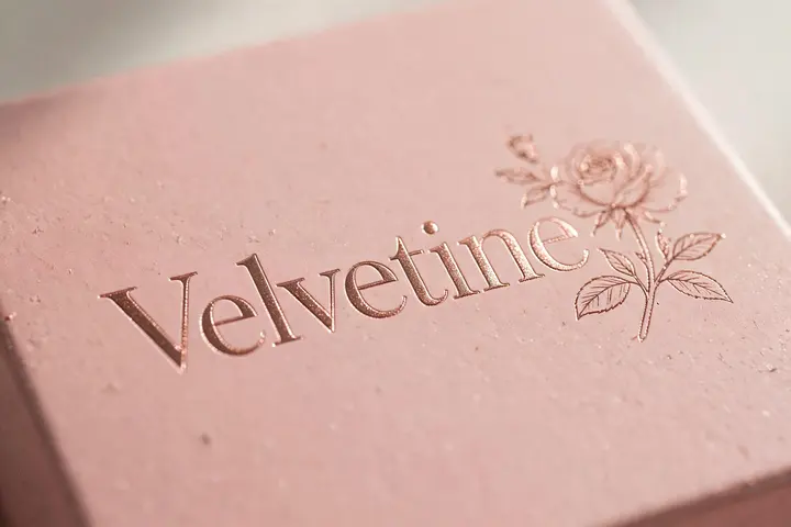 Material close-up